
(this is 75% shitpost)
If you don’t know what LitRPGs are, please click here. If you know about LitRPGs but not blue boxes, click here instead. Or don’t, and bravely soldier on.
Alright, now that I have your attention, it’s time to analyze RoyalRoad’s modern blue box landscape, as of April 2024.
A story without boxes is like Christmas with nothing under the tree. You can do it, sure, but surely nobody can deny that it just isn’t the same. Now, it’s been years since tables were injected into the LitRPG landscape. I expect by now, lots of cool box permutations have arisen—they’ve evolved.
So I decided to drink in the metagame by trawling through many new and popular RoyalRoad stories, plus a few rogues and dark horses. What box innovations do YOU need to make to keep up? Find out.
Joining me are three box-themed judges:
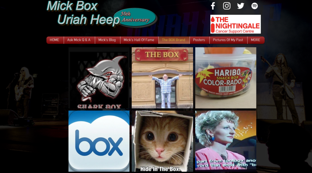
- A man with “Box” in his name. He so greatly loves boxes and the box lifestyle that his personal website includes a photo gallery of “the BOX Brand,” which is just random photos including boxes or the word “box.”

- A famous boxer from a movie. I couldn’t get the rights to Rocky Balboa for this post, so I had to get the dude from Ricky 1 instead. His name is Ricky Wanero.
- The Cologuard Box. I don’t think I need to explain this. I mean, HE IS A BOX. He’s living the life of a blue box every day, and he knows a shitty box when he sees it. Now, his one downside is that false positive and false negative results may occur. Hopefully the verdicts of the other judges will counterbalance that.
Our judging criteria:
- Boxes should be crisp and clean. Information must be presented in a clear and comprehensible manner. Mind you, we appreciate a good colorful or quirky box, but that should not stand in the way of information. These things are primarily stat boxes and system messages, after all. They mustn’t forget their roots! Primarily, they share information.
- To go above and beyond, boxes may also be creative and colorful.
- However, they must always stay easy on the eyes. They should delight the corneas, not overexcite.
Also, in case it wasn’t clear, we are evaluating the following stories purely based on their boxes. They may be good or bad, funny or sad. We can’t vouch for that. We’re ride or die for those boxes.
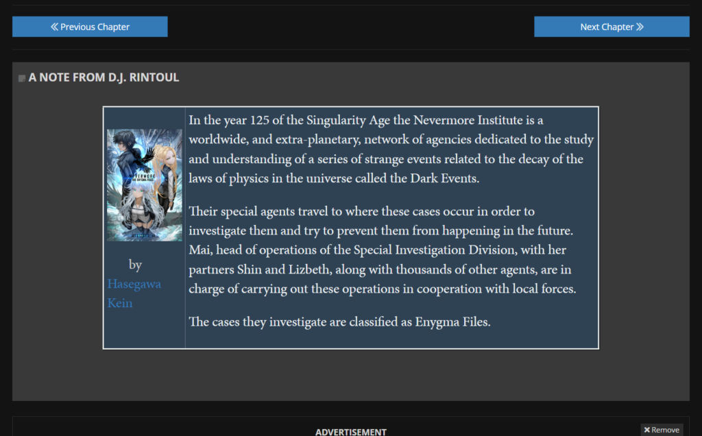
Entrant 1: Cog Cultivator
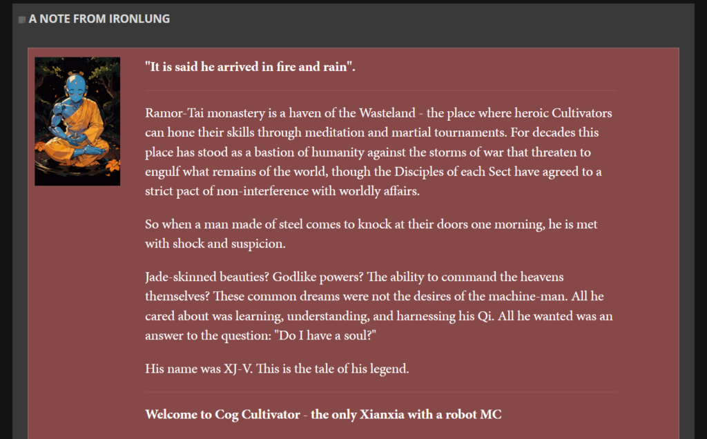
What an elegant box this is to start us off! It even uses a saffron red that complements the tones of the cover it serves as a frame for.
Okay, this is certainly not a box qua box, at least not in the way classic Boxists may be used to. It’s a pre-story blurb for those who may have clicked a link to the story from elsewhere (like another author’s story shoutout, for example). But it certainly bodes well for all the boxes to come.
…Huh, there aren’t any more boxes after that one.
- Crispness: 10/10
- Vibrancy: 8/10
- Eyebalm: 10/10
- Volume: 1/10
As you can see, we had to add a fourth category. We need a way to penalize stories that don’t take proper advantage of their boxes. In terms of sheer box volume, Cog Cultivator has done the bare minimum and our panelists agree that that is a great disservice.
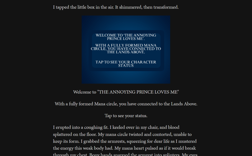
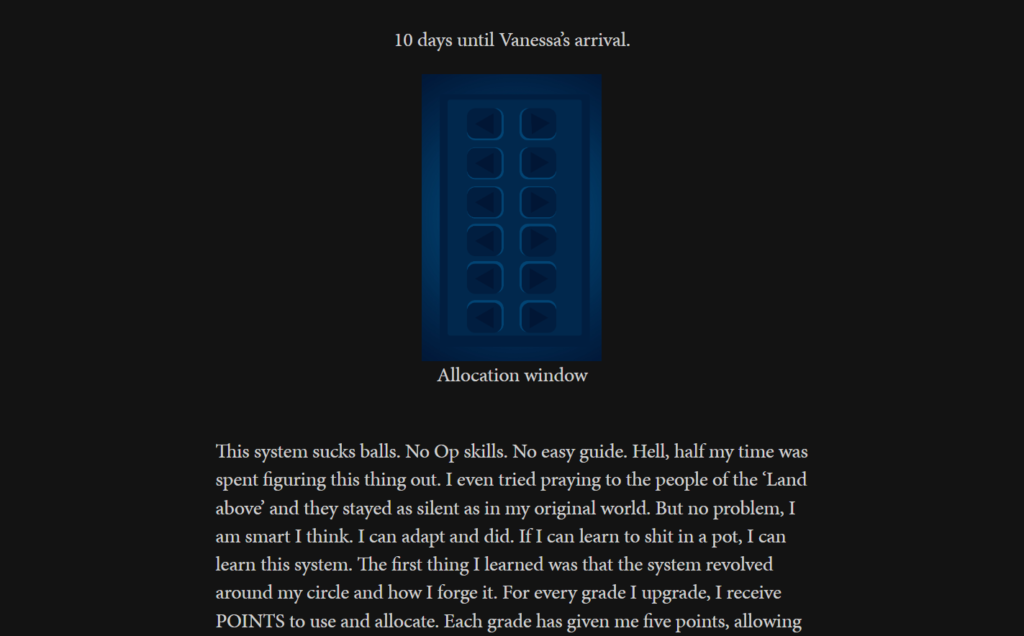
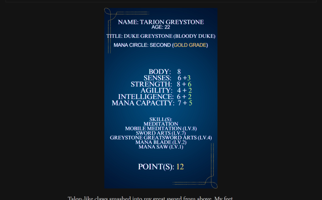
Entrant 2: Madman Apocalypse
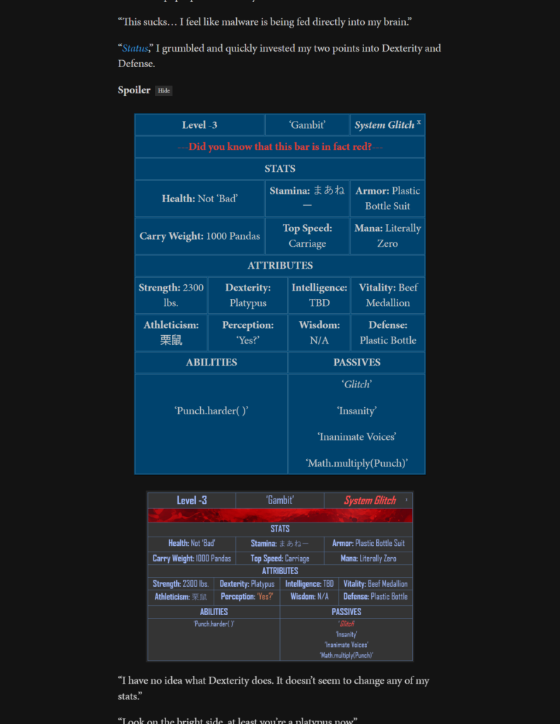
What’s this? A story that, in between expressive colorful boxless text, not only uses ample boxes for both system messages and character stats (along with running gags), but also pushes RoyalRoad’s table formatting options to their limits?! Why, we might be in Blue Box Heaven.
Folks, we may have come upon a winner already.
But wait…hold on. Why can’t I highlight any of the text in these boxes?
My gosh. These aren’t boxes, they’re images masquerading as boxes.
The revelation that half of these boxes are, in fact, fake-o boxes has thrown our judges into a tizzy. What this author has done is put non-boxes in the story…but include actual boxes just before these fakers. In this case, the boxes are serving as accessibility text, suitable for people with limited vision, text-to-speech, and so on.
Also, seriously, take a look at all the other wild and wacky image types.

After conferring for several heated minutes, they’ve decided with heavy hearts that while Madman Apocalypse will not be disqualified, it WILL have to be penalized for this, and are adding a fifth category for this purpose.
- Crispness: 8/10
- Vibrancy: 10/10
- Eyebalm: 8/10
- Volume: 10/10
- Really Are Boxes: 5/10
Entrant 3: Apocalypse Arena (formerly Godpuncher)
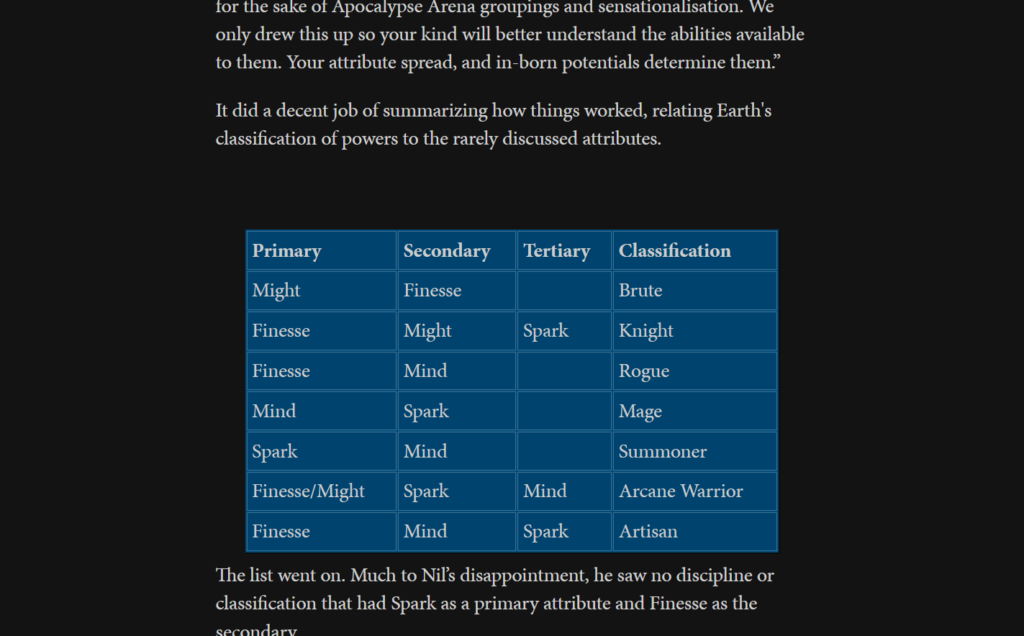
I am saddened to announce that here is our first great disappointment. This story gets off to a shaky start, with little box action in its first couple of chapters, but a very informative grid in Chapter 3 shows promise.
Then it all goes south. Once the protagonist starts getting Stats, they’re presented in bold text—with the boxes, apparently, never to return.
It hurts your heart to see this.
The judges have decreed that henceforth, any story with just one box will be disqualified. Even if it’s the mightiest box in the world.
NO GRADE
DISQUALIFIED
Entrant 4: Slave Origin Playthrough

Oh, that is cruel. Who sent us this? This story doesn’t use boxes, it uses regular old text sandwiched in between dividers!
Granted, these dividers are admittedly fancy. They might be original creations drawn up uniquely for this story, showing love and care in the presentation. And they do present their info in an orderly, dare I say crisp fashion.
But come on! In what world is this a box???
NO GRADE
DISQUALIFIED
Entrant 5: Echo’s Evolution
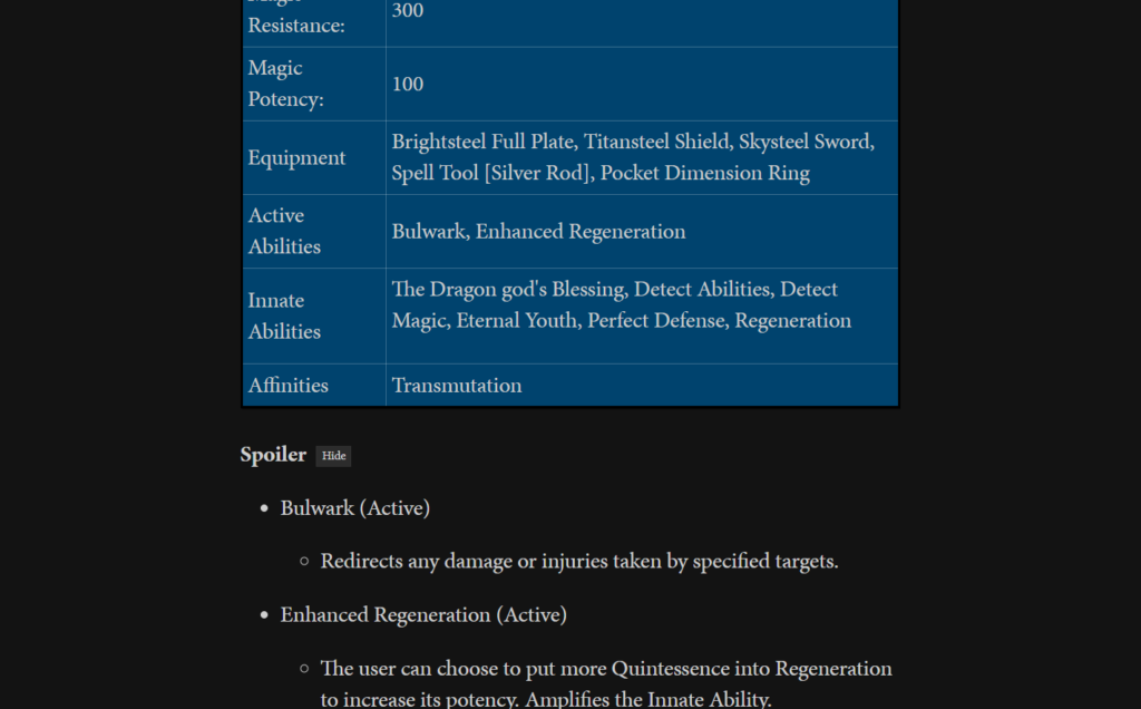
This is a curious case. On one hand, we have some very presentable boxes. I wouldn’t call them revolutionary boxes by any means, but there is nothing at all bothersome about them.
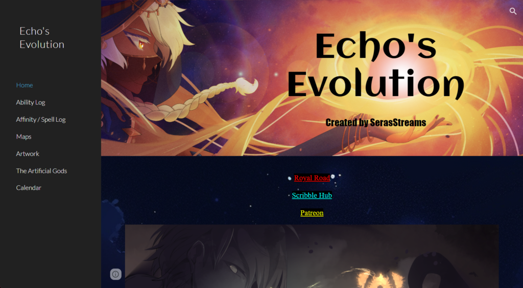
On the other, we have other system messages presented in text, occasionally pressed between eye-pleasing dividers. Still more of it is actually housed on the author’s personal website for the story, alongside artwork and hi-res versions of the maps also shown in-story (sadly, not ASCII maps within tables). This gives the intriguing impression that the world of Echo’s Evolution is not just more multimedia, but larger than the typical RoyalRoad fiction.
The result is that we have a story where tables are merely the side dish to the main course that is bulleted lists with dividers, and the dessert that is Echo’s own website.
This…is very hard to judge in terms of boxiness. But even if it were to involve more boxes, they wouldn’t be home runs, sorry to say.
- Crispness: 10/10
- Vibrancy: 5/10
- Eyebalm: 10/10
- Volume: 3/10
- Really Are Boxes: 10/10
Entrant 6: A Universe of Bloody Evolution
Okay, this one is disqualified right off the bat for no boxes whatsoever, but I wanted to give it props for one thing: coloring text referring to certain game elements. That at least embraces our Box Brand Standard of creatively prettifying game elements, and in a way that also makes them more memorable for readers.
I have no clue if it’s accessible across both Light Mode and Dark Mode, but hey, we’re not judging this story anyway so I don’t have to figure that out!
NO GRADE
DISQUALIFIED
Entrant 7: Reincarnated as the Duke from the North
Could it be? At last, good news for boxes everywhere…?
Well, the judges are conflicted. On the one hand, much like Madman Apocalypse, these are boxes, but not as we know them. On the other, these represent an evolutionary divergence far different from Madman’s. One look will tell you why.


I feel like I’m playing Jeopardy.
Okay, what these certifiably don’t do is ground me in the setting, because they feel even more computer-y than most systems do. In fact, part of their appeal for me is how they look kind of 90/00s-cyber. Very at odds with the place.
But we give props for originality here, even to things that are NOT boxes and NOT very crisply presented. Note, however, that the author has taken constructive criticism to heart over the course of the story and reformatted the boxes for steadily advancing crispness and prettification. As of Chapter 10, there are some fun borders inside the main box that communicate a little bonus aristocracy.
- Crispness: 6/10, could go higher if author continues to improve
- Vibrancy: 8/10
- Eyebalm: 6/10
- Volume: 7/10
- Really Are Boxes: 0/10
Entrant 8: Re: Butterfly
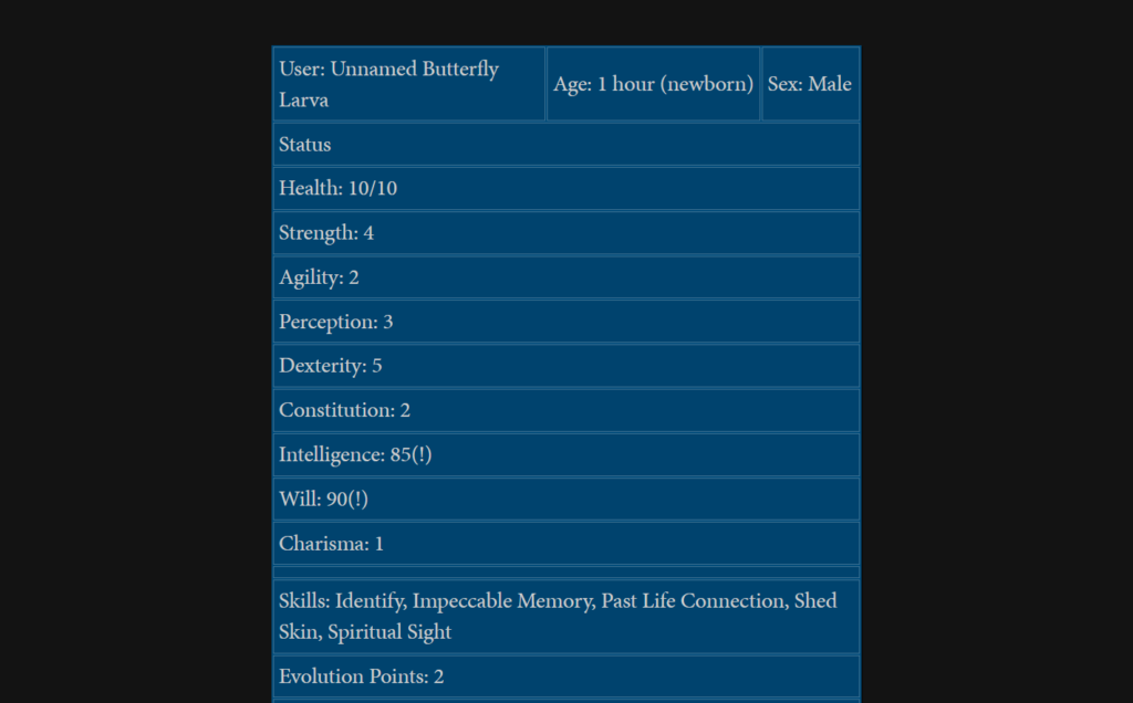
Very lukewarm on this one. The boxes are so infrequent that they almost may as well not be there. They are crisply presented, very normal and straight-laced.
But one can’t help but notice the colorful boxes that DO appear…as once-a-chapter ads for other stories! And while this has happened with some stories we’ve looked at earlier, I want to stop and highlight it here.
Different color choice and creative frame layouts show that their creator (whether the author of Re: Butterfly or the authors of those respective stories) has taken these ad-boxes above and beyond. The colors certainly grab readers’ attention before they get to a story filled mostly with the site default’s color scheme.
When I put it that way, it sounds cynical, as if the one pop of color we are allowed is employed in service of advertisements only. But keep in mind that advertisements between RR stories are typically not ads from mindless corporations. They’re authors supporting authors, making loops of recommended fiction. In that sense, it’s endearing that they would give pops of color to the fellow writers they want to support.
Still, it means boxes are not nearly as frequent, or as diverse in their use, as they could have been. Points off for that.
- Crispness: 10/10
- Vibrancy: 7/10
- Eyebalm: 8/10
- Volume: 5/10
- Really Are Boxes: 10/10
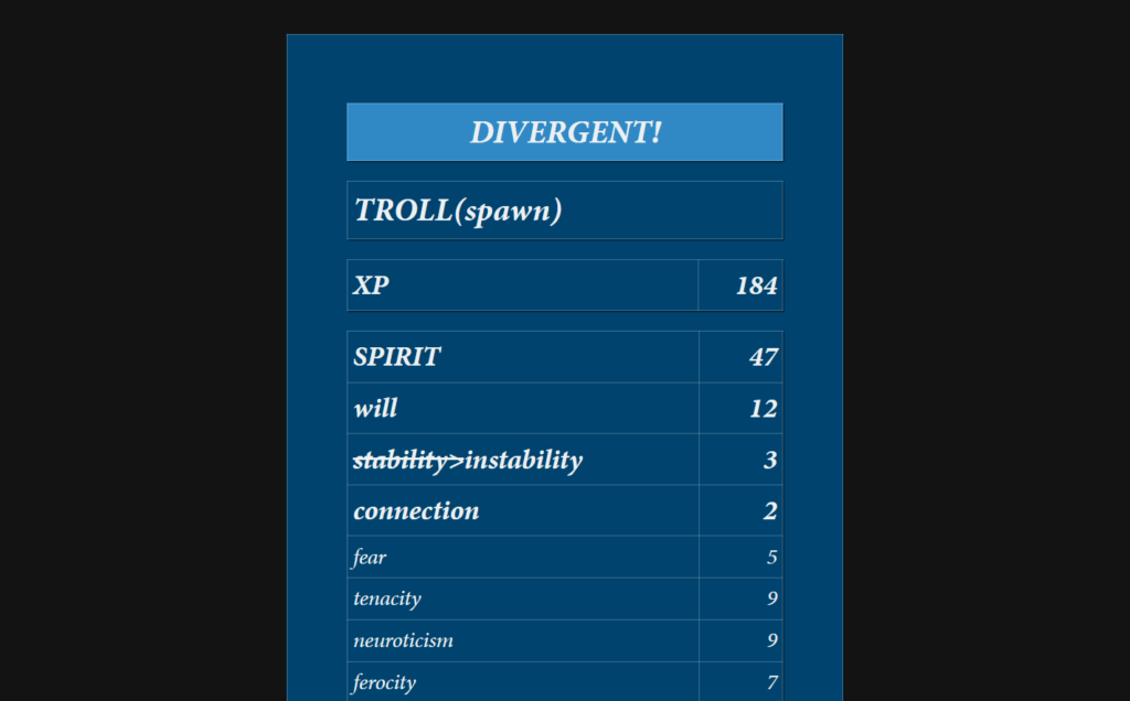
Entrant 9: trol: runt progreshun
We have another split decision!
Ricky 1 says this story’s boxes are “amazing, best boxes I’ve ever seen.” Cologuard, in a rare display of fury, steadfastly insists that these are in no way boxes. Mick Box hangs back chuckling to himself as they throw hands. Eventually Cologuard is beaten, and the false positive and false negative results that may occur go flying everywhere.
As janitors clean up, Mick admits that he has no clue what he’s even looking at. He says it hurts his eyes, and I redirect him to the high-resolution image hosted on the author of trol: runt progreshun’s personal website. That may not help because as of April 18th, the main tables in this story look like this:

It is ironic that a story about a troll whose dialogue resembles that of lolcats has some of the most complicated “tables” of all time. Really, it’s not the information itself that is so dense: it’s the presentation. Words are literally dense, stacked on top of each other, jutting out at odd angles. And they’re jutting out of a triangle. A triangle.
Mick complains to me that he must be going stark raving mad over here, for nothing in these images suggests squares (let alone tables). And tables are the whole reason why we’re here. Why, then, lavish so much attention on it?
Days pass. We sit on our judging tallies, unsure of what direction we will go, which way we will lead our people. They depend on us to give the final word, the be-all end-all on what boxes are the best. On which are to be shunned.
As rain falls, we look again at trol: runt progreshun. The tables have entirely changed. Now they look like this:
Cologuard cheers. Mick “the Wizard” plays a sweet lick. Ricky 1 hangs his head, he feels a loss. So do I.
The original “spheraxial diagrams” are preserved on the author’s personal website and their influence is otherwise immortalized in several concerned comments.
The tables which replace them are definitely cleaner and easier to comprehend. They’re even creative! With minor color variations and major text size fluctuations, they better reflect the themes of the story: troll with caveman-like vocabulary gets bigger. This isn’t technically “vibrant,” but it is very expressive, so we decide to judge it as such.
We have to alter our judging cards to reflect the news:
- Crispness: 7/10
- Vibrancy: 9/10
- Eyebalm: 6/10
- Volume: 7/10
- Really Are Boxes: 10/10
Something was gained—undoubtedly the more normal boxes will have an easier time hooking an audience—but no RoyalRoad story ever had spheraxial diagrams and none will again.
With this upheaval comes a realization. I was a fool to think we could ever quantify the value of a box. When the results come in, I cast my arm across the counter, flinging our results everywhere. Most of them end up in a nearby furnace, never to return.
The real value of the boxes is their value in our hearts.
Fall of the Box, Rise of the Image?
One of my conclusions is that boxes have mostly been abandoned. Yes, there are stories still using RoyalRoad’s built-in table formatting features, but mostly for their utility, very rarely exploiting their aesthetic potential. And there are those in the “old guard,” like A Dragon Idol’s Reincarnation Tale, that may only use boxes because they’ve been using boxes for years now. Relics, perhaps, from a time when they were more expected.
One reason they’re fading is because these boxes aren’t portable. You can’t just copy and paste a table from RoyalRoad into other fiction-hosting sites, and the big one, where all the money is, is Amazon. Okay, maybe there are table options for ebooks, but none that I’ve ever seen. Even if they do exist, is it really worth, say, tweaking the colors for prettiful tables when so many e-readers are in black and white? And who’s seriously buying LitRPGs for their sweet complementary colors?
What’s in vogue is something a lot more portable…words. Yep, just words. Words presented in an orderly fashion, with little fuss. Nobody’s getting angry at writers who just present boldface text or, dare I say it, a bulleted list.
But a good second place is pictures. The first story I noticed really taking advantage of artwork is Saintess Summons Skeletons. This includes maps, character artwork, frequent chapter illustrations, and cute bone-themed dividers. It was not alone in using art; it was just big, and it seemed to have the most. I’m not sure how much artwork was published with the original run of World Concept’s three concurrent series, but now that those are being rebooted as the Brightlyre series, chapters have frequent artwork (AI-generated, then touched up). In both cases, there are no tables in sight.
By far the most common use of pictures is for maps. But we can see some other creative-yet-useful uses. Foxification ends chapters with maps as well as pictures of its monsters. In Reborn as a Fantasy General, on at least one occasion, an image is used to display overhead troop tactics.
So…yeah. Boxes are feeling depreciated in this world of images. Just in time for me to make my own table-heavy story Catgirl System, of course! This is what I get for mostly being a hermit.
The one thing boxes have over images is that they’re generally more accessible. Screen readers work best with pure text, and many people who use images don’t add accessibility text. Even when they do, there is always info lost in the transition from picture to words. A table loses very little.
Maybe boxes will never be as versatile as a canvas that will allow you to slather on just about anything. But limitations breed creativity, no? Why not bring boxes back and herald your own personal Box Revolution? Why not take my ASCII-map quip seriously and make some jank-ass artwork inside those things without having to drop a single .jpg?
Or why not sprint off in the other direction and do more truly wild things with images? The worst that could happen is that you inspire others and/or give Box Man a headache. I love that shit, whether it’s off the wall or just bubblegum colors.

Yes, I had to save a slice of my own story here too. Hey, it counts as preservation…RoyalRoad will not be what it is now forever! As we’ve already seen with trol: runt progreshun, authors retool their own chapters all the time, sometimes for more than just grammar fixes. On top of that, half of these authors are gonna pack up shop and drop their work on Amazon and its exclusive Kindle Unlimited program within the year. Melancholy, maybe, but true. So if you don’t pull out the Archive.org crawlers, you ‘ll never be able to access a lot of these tables and pictures again.
I’ve had a lot of fun messing with a mixture of tables, images, and tables converted to images (for PDF and an eventual print release). I hope readers do too! I think tables and pictures are things that can really make LitRPGs stand out as uniquely fun reading. “Toyetic” reading, if you will. Another thing that makes them a separate experience from the typical fantasy, and that it doesn’t hurt for many authors to embrace once in a while.
Writing Accountability Zone: How’s Catgirl System Doing?
I vowed many long months ago to use these blog posts as a way to keep myself accountable for working consistently (or half-consistently) on my LitRPG.
Recently I’ve been getting Book 2 together and stashing more advance-release chapters on all three websites where it’s posting. (Well, you can’t schedule posts in advance for SpaceBattles, but that’d sure make things mildly easier.) Book 1 won’t all be out until June, but even before then, the Patreon will have reached the second book, so that all needs to be ready by early May.
Then I have to consider when I’ll release print and ebooks…and yes, I do want to transition to KU, though it makes part of me sad. If I were in it for nothing but money, I’d be hauling ass on something a lot more profitable, but yes, I do need money. I had no idea United States taxes for freelancers were so high until I spent a year both out of school and freelancing. Dang.
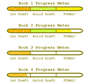
Anyway, all of this means that Book 2 is substantially done! The actual prose editing and most of the formatting is complete. Tables need to be compiled through the arduous process I told you about in my post about Blue Box Madness. Somewhat less arduous now that I’m used to it.
Well, this is the world I live in, these are the hands I’m given. This is the path I’ve taken, this is the thing I’m makin’. Next on the trail will be, of course, editing Book 3. It never ends until it ends.
Thank you for reading, and Patrons, thank you for Patreonning.
I’ve blogged a bunch about writing and being at peace with it, including this post about doing it just for its own sake. I also write about other nonsense, like the Scoobydoo and the best music videos to dance poorly to.
nice xD