
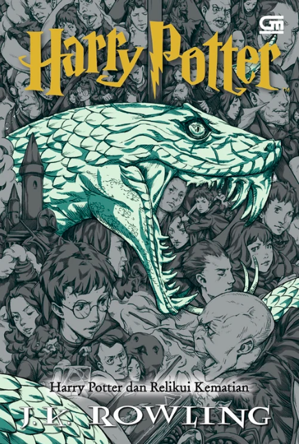
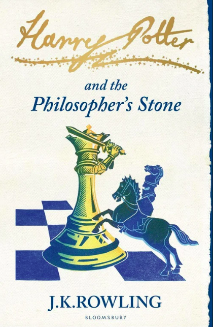
Pt. 4.5 of The Harry Potter Readstravaganza
Intro (Pt. 0)
Reviews:
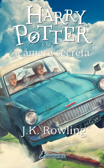
Book 1 · 2 · 3 · 4 · 5 · 6 · 7 (pt. 1 + 2)
Book Covers:
Special Editions · International (pt. 1 + 2)
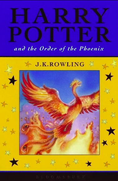
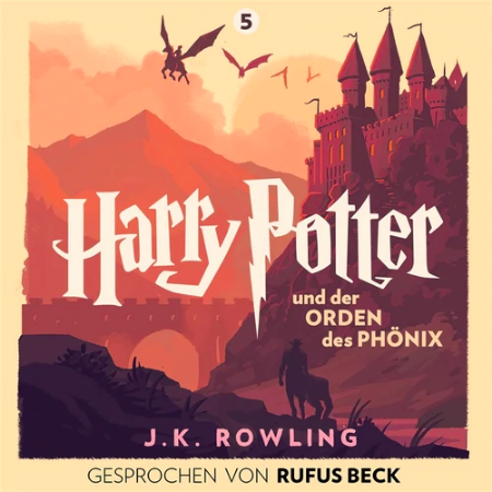
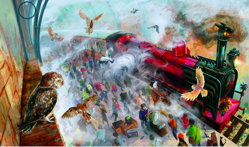
I’m still finishing Order of the Phoenix (it’s way too long). In the meantime, maybe this’ll wet your whistle.
It’s Harry time.
Since there are, y’know, five million different editions of Harry Potter with about as many covers, I figured I’d rank them all! …Or maybe just a large chunk of them. Some are rereleases of just the first book, some are just redundant, some are covers that I’ve mentioned already and that would not be that funny to mention again.
For instance, do you REALLY want me to rank this British “Celebratory Edition?” Well, if I WERE ranking it, it’d be SERIOUSLY low, because the border means less space for the drawing and the stars, really, are embarrassing.

And these just depress me. Harry Potter’s American publisher made these weird special editions for at least two books. One uses blown-up chapter art — still in black and white, looking very awkward — the other uses a microscopic cover snippet. I don’t wanna look at these anymore.
That said, here are the Top 18 Alternate Harry Potter Cover Series from Around the World (in my great opinion).
#18-15: All The Adult Editions (They’re Boring)
I’m just gonna quietly lump all these together.
The original adult editions were such an affront to public sensibility that they were discontinued after Goblet of Fire. I’d feel bad for saying that if they didn’t strike me as so uncreative.
Yep. Black and white. That’s how you know it’s for adults. Brings ’em back to when they were young.
These covers were replaced by something more colorful but less lively (proving that creating something even less lively is possible). Like a well-produced, big-budget movie that nonetheless gets a 6.5. Not horrible by any stretch. Not much more than perfunctory!
These Russian editions are the same way…
…but these German adult editions offend me the most. They’re so smooth, so polished, and they definitely don’t follow the Twilight School of Taste for Covers. But they use their powers for evil.
These are the child-proof caps of the cover world. Despite adhering to good compositional rules and using vibrant, contrasting colors, they drain inspiration from a room. Though claiming to chronicle the life of a wizard child, they suggest educational VHS tapes on Appalachian wildlife.
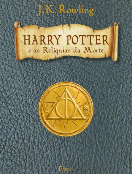
#14: 2012 Brazilian Collector’s Edition
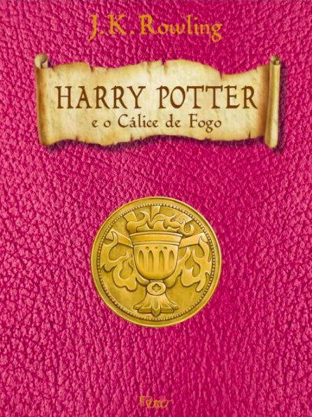
Again — very tasteful! Polished and even a little creative. (Who thought of pink for Goblet of Fire?) It’s just…I don’t want these things on my shelf, dude.
#13: French 2011 Junior Folio Edition
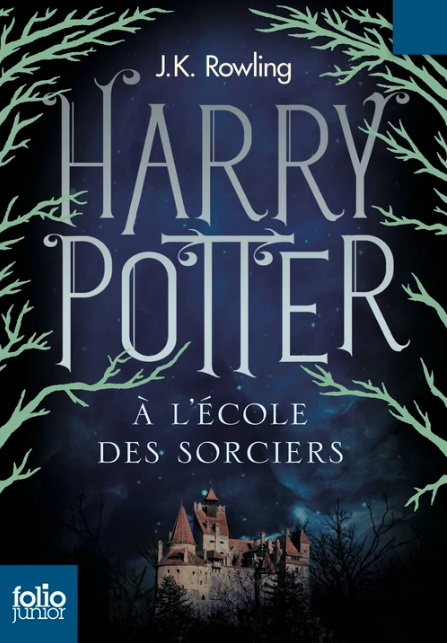
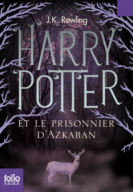
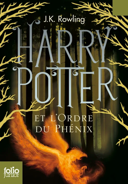
Very YA of you, Harry. These covers look like a shrewd marketing decision. Some are kinda cluttered. Those squares in the corners were a mistake. Or maybe not; they were very helpful as guides when I cropped the images.
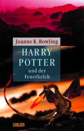
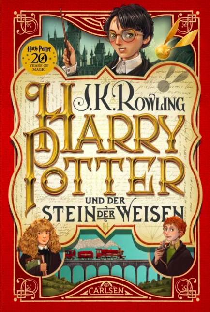
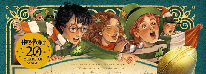
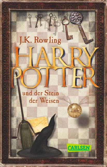
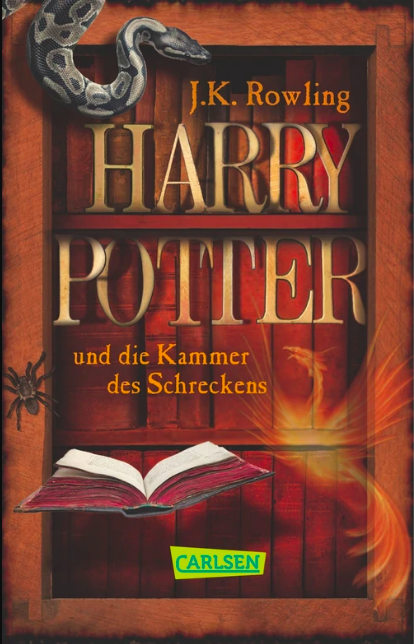
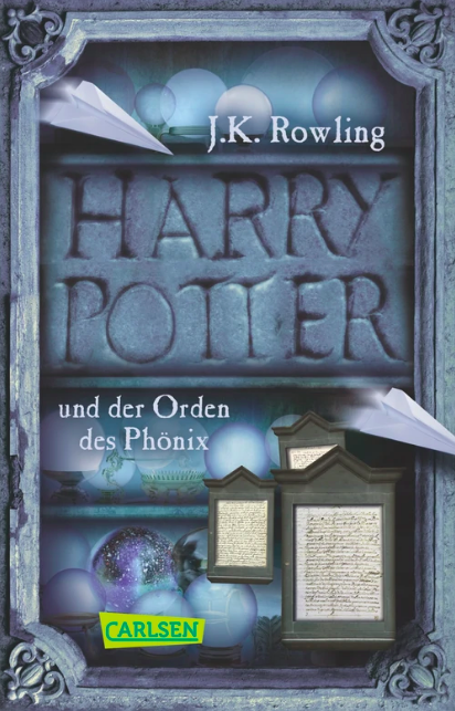
#12: German 2018 “20 Years of Magic” Edition
Now it’s time for the fun stuff.
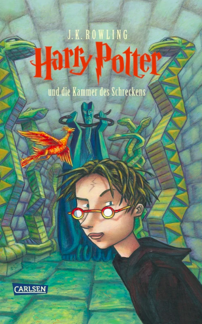
Before I show you these, let me remind you of the standard German editions. Specifically, their Harries.
When I first saw the 20 Years of Magic editions, I found them to be a marked improvement. I mean, the composition’s pretty sweet, even if it gives more space to words and cream-color backdrop instead of pictures…and you gotta love the intricate wrought-iron designs.
But…I don’t know. Something was off about that Harry and something’s off about this one too. Something’s running in this family and I don’t like it. I don’t like it at all. But I dunno. You tell me. You be the judge.
#11: Spanish 2014 Redesigns
We’re in “definitively good” territory now. All my problems with these covers (and the ones above, come to think of it) are essentially nitpicking. Time, effort, love, and skill went into these babies. Above are the better, more badass ones. Drink it all in. Drink it.
But when you get closer in, they start looking like video game models.

#10: 2010 Pocket and 2018 Anniversary Editions
These covers are located squarely in “I’d put that on my wall as a poster” territory. Beautiful, clean, deceptively simple. Unfortunately, they’re like a movie I’d give an 8/10 but would never care to see again. I’m not gonna give ‘em an Academy or anything.
#9: German 2013 Anniversary Pocket Edition
While very obviously worse than the entries above, they’re more interesting to my eye AND they evoke those old I Spy books I used to have. Gaudy. Cozy.
Each one is a picture frame. Did you know that!?
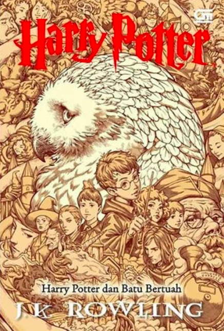
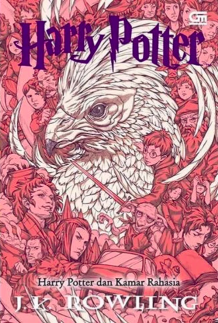
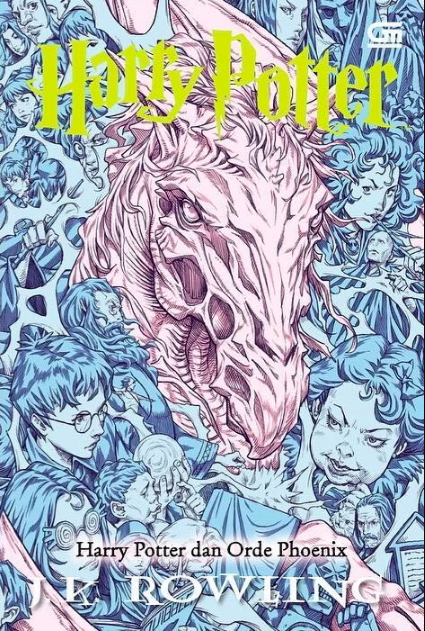
#8: Chinese Collector’s Edition
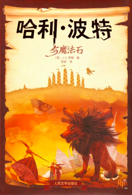
These are awesome. Watercolor look, beautiful and super-strange choices of subject (when in Phicopherdestet’s Stone did Harry and Hermione ever go strolling around in Hogwarts Ground Zero?)
Sadly, what’s bringing them down for me is how complicated the composition is. The really cool stuff only takes up 50% of the cover (not to mention the anti-frame frame of wood behind a tattered scroll, which I think is a bit much). Not only that, but if you stare at the feet of the creature on each cover, you’ll notice at last that they’re leaping through the canvas! Decent idea, but the execution is weird — if they creatures are jumping right at you, why isn’t this hippogriff’s wing going past the boundaries of the scroll?

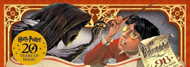
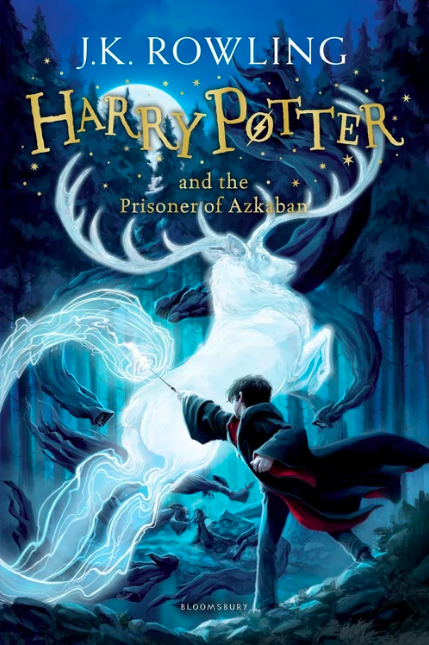
#7: American 2015 Pottermore Digital Edition

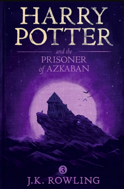
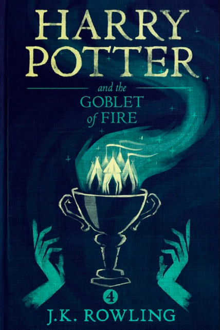
I’ve been reading Order of the Phoenix digitally, meaning I’ve had to look at this cover about 15 milliseconds per day of reading. (The program goes almost straight to the page I left off on, you see.)
I thought these covers were kinda boring at first, but they’re growing on me. A simple and creative concept, taken into the endzone, done cleanly and well. Plus, they manage to be both moody and whimsical — not too far to either end. (Except Goblet, that one’s got the whimsy hands.)
Plus, if you get up close, you see they went the extra mile, “dirtying up” the covers so they look like aging bound books. Not even my mother puts that much effort into her book covers!
(Begs the question of why we should want our digi-books to look so much like book-books, though.)
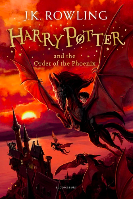
#6: German 2016 Pottermore Exclusive Audiobook

It’s a tough call between these and the last ones for me; both are tasteful, simple themes, deceptively minimalist. I have fun seeing the changing weather and times of day here, the light and shadow on the castle, the changing landscape. I’d call it…heartwarming. And what freakin’ beautiful colors.
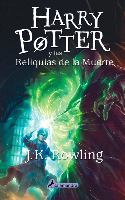
It’s too bad all these Phoenix covers keep spoiling the same great scene of everyone flying. Dangit.
#5: Indonesian 2017 Celebration Paperback
Finally — Harry Goes Anime! I don’t just mean the faces and proportions of him and his friends; each one of these is the cover to a Disgaea game. It’s badass.
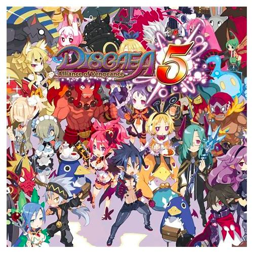
These are the kinds of covers that, if they were coming out during Harry Potter’s official run, would be unappealing: monotone, faded colors, buncha characters nobody knows nor cares about. The kinds of covers that can only exist as special editions meant to be bought together by people who are certified fans already.
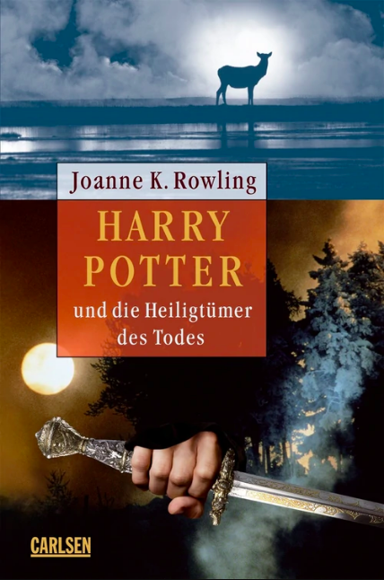
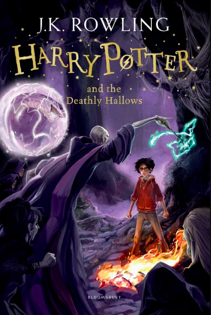
#4: Clare Melinsky’s Signature Edition
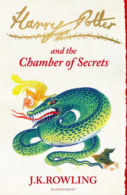
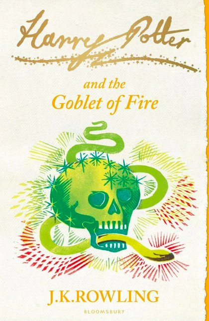
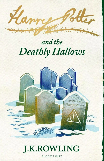
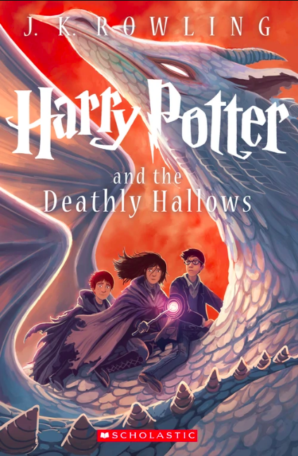
These things have color and charm for days! Vibrant, but not loud. Neat, but not cute. (Except the skull on Goblet which, I would think, is the thing you’d least want to look cute, but that’s okay.) Also, for some reason, the Deathly Hallows covers that show graves really captivate me; maybe I just like seeing finales that are solemn and understated and don’t show Voldemort dangling his wand in front of tiny Harry’s face.
This is probably the collection I’d most want to own and set on my shelf. Sadly, I can’t make it #1 because I can’t downplay all the complex, imaginative, richly painted work of our Top Three.
Warning: the covers you are about to see all look — on the surface — about the same. But as with many pleasures of life, ya gotta dig a little deeper.
#3: 2014 Children’s Edition

These are clearly the big-budget CG-animated movies of the Harry Potter cover world.For as gorgeous as these are, and as nice as it is to see Round-Haired Harry get his time in the limelight…if I saw these covers on a shelf, I don’t think I’d look twice. I guess there’s nothing in the pictures that makes me curious or thrilled. They look pretty…normal?
Definitely a 9/10 movie that I’d never see again.
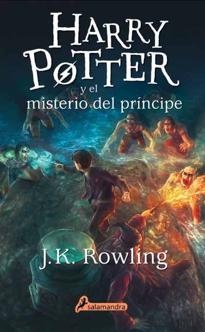
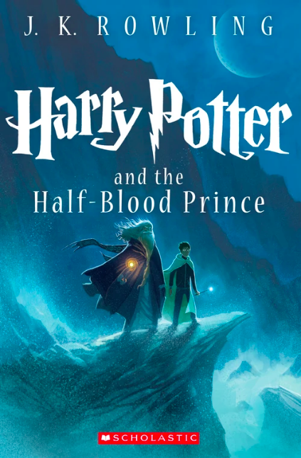
Also, is the scene in Half-Blood Prince where Harry and Dumbledore go to the cave and fight water people the only fuckin’ scene anybody remembers? Is it really that bad? Stop drawing it!
#2: American 15th Anniversary Edition (America Wins Again)
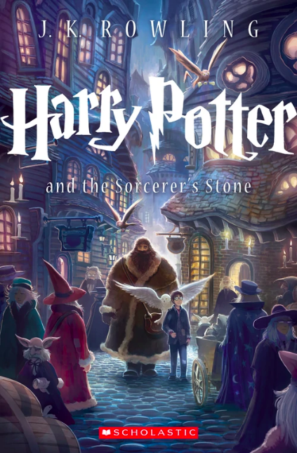
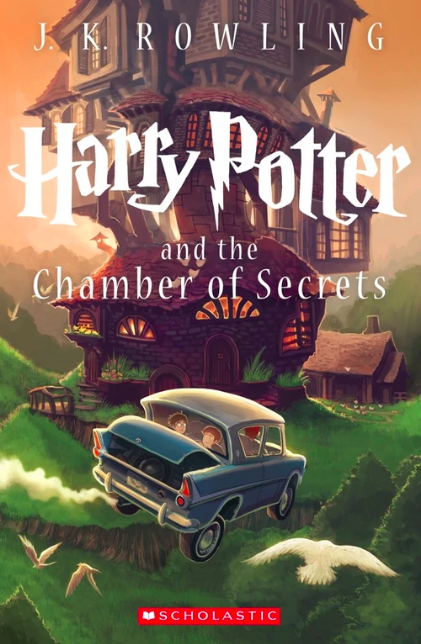
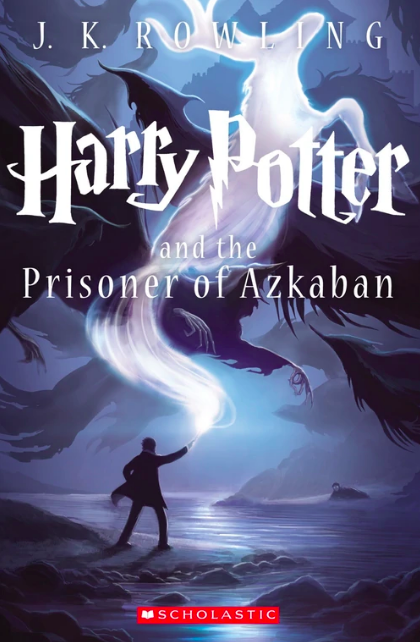
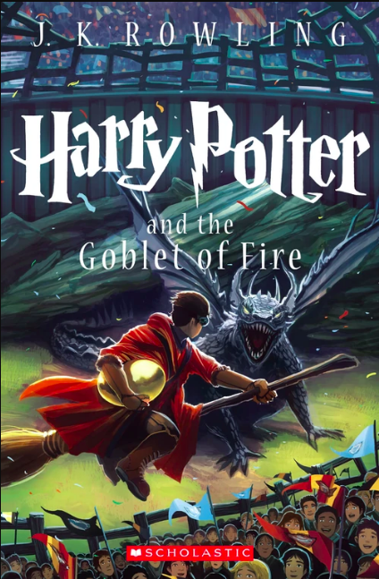
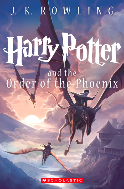
These pictures are as glazed and slick as laundry soap. Is that a blessing or a curse? For me, definitely a blessing. The “clean” look gives it an edge over the English editions above for me. More than that, though, is the cover for the first book — huge and dazzling, and warm, and such an unusual but fitting choice for the first book. The rest I could kind of take or leave, to be honest.
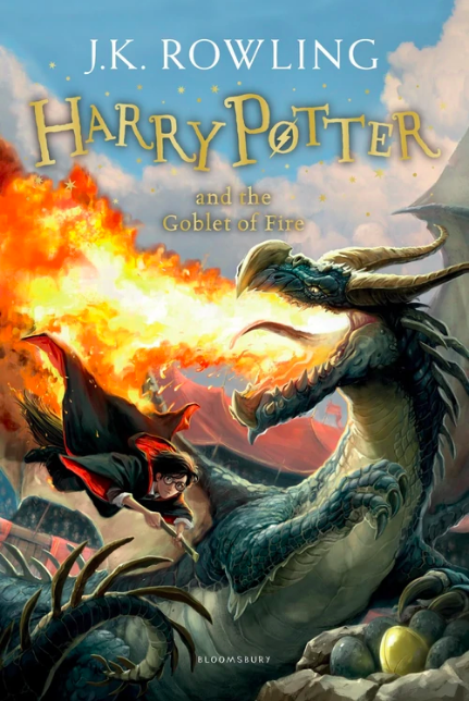
#1: Universal Illustrated Edition
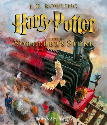
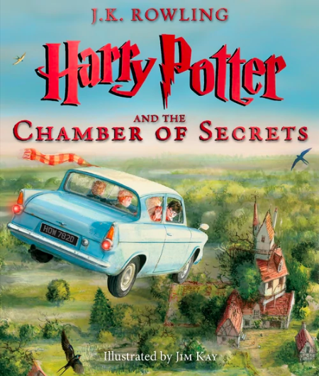
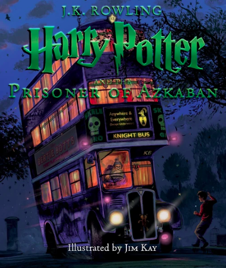
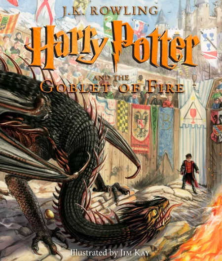
HERE’S the crazy stuff! HERE’S the goods! HERE’S the razzle-dazzle! Not too rough, not too clean, unique. Plus, the Harries are not too cartoony and not terrifyingly hyper-realistic. Goblet in particular boggles my brainbiscuits.
But the craziest stuff of this stuff is, the whole books are illustrated. That’s why there are only four — they’re still being made. I’d say that’s way too much work, but then again the illustrator is probably getting paid way too much money. (Or hopefully?)
If I got these as a birthday present, I wouldn’t just be content; I’d be happy steadily losing possessions for the remainder of the year.
My Obligatory Conclusion
What great covers! What adequate covers! They run the gamut. Thankfully none of them are just repulsive, though.
If you’re reading my Readstravaganza in order, click here to forge ahead into my Order of the Phoenix review. Or see me talk about EVEN MORE covers (they can get pretty strange)!
Intro (Pt. 0)
Reviews:
Book 1 · 2 · 3 · 4 · 5 · 6 · 7 (pt. 1 + 2)
Book Covers:
Special Editions · International (pt. 1 + 2)
Patreon:
(okay, not a book but it’s neat)
Good article. From Reddit, can confirm.