Pt. 0 of The Harry Potter Readstravaganza
Reviews:
Book 1 · 2 · 3 · 4 · 5 · 6 · 7 (pt. 1 + 2)
Book Covers:
Special Editions · International (pt. 1 + 2)
Harry Potter is just another series on my neverending list of stuff to read. I’ve never read it before, which is surprising because I grew up with the books, and fans of the books, and movies based on the books, and birthday parties inspired by the books, all around me. I claimed to like reading, too.
And I liked doing whatever my older brother liked–I watched the TV shows he watched, read the comics he read. But he was the devotee. I remember him loving the Redwall series, and me meanwhile picking up Rakkety Tam for only about a hot minute.
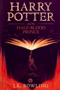
But you couldn’t grow up in a 2000s American suburb without frequently bumping into Harry Potter. I’ve seen portions of every movie, not always paying full attention (I really have no clue why I was taken to The Half-Blood Prince, and today I only remember 1.5 things from it). I know the houses, the main characters, the basic context needed to understand the memes that occasionally cross my path…“expect a patronus”…etc. etc.
But I call myself a writer, so I’ve gotta read pop cultural touchstones, even if I’m coming to them late.
Thus begins a Harry Potter reading series. If you’re interested, I hope you’ll chat with me about it, and feed me questions along the way, so I can pump out #HarryPotterHotTakes.
The Covers
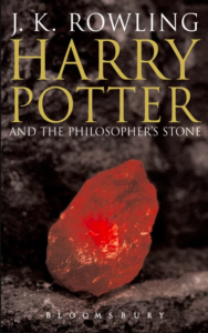
I thought I’d start by looking at some book covers. If you’re from the UK, this is probably how you’re used to seeing the first book:
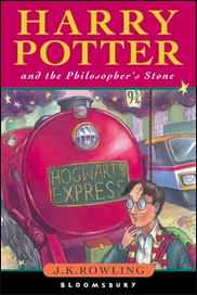
But to me, that Harry just looks like a doofus. Especially after I’ve seen this draft of the cover:
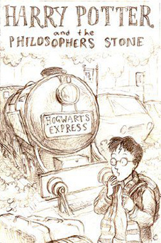
Like Harry’s just wandering around going “huh? a train? where?” and meanwhile the train is one second away from plowing into him–this could only end in blood. What an idiot.
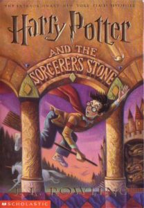
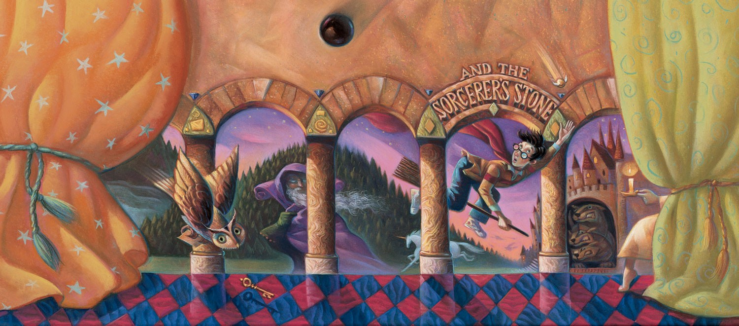
I got the American Harry, and this guy is all action, flying in on his cool broom. The American Harries (and a lot of international editions) were drawn by Mary GrandPré. I’m not sure why they couldn’t just have reused the British art…
Oh. Oh yeah. It’s because the British Harry looks like a doofus.
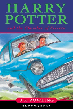
It’s not just the first Harry, either.
While I don’t deny that the original covers are charming and great, I do have to prefer the US versions. There’s something weird and even uncanny about the style that reminds me of Lane Smith’s children’s book illustrations, a little. Is it the gradients? Do you get what I’m talking about?
Although sometimes they do look like doofuses.
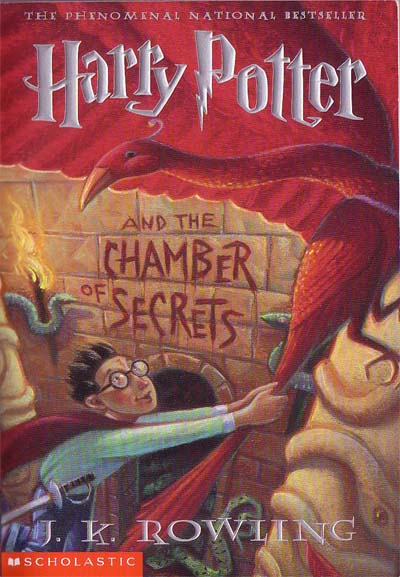
And sometimes they just get bizarre. Look at this cover, for instance. It’s pretty normal. It’s just a kid hanging onto a bird and a…um…a red…curtain or sky-thing behind them. Whatever. It looks good, doesn’t it?
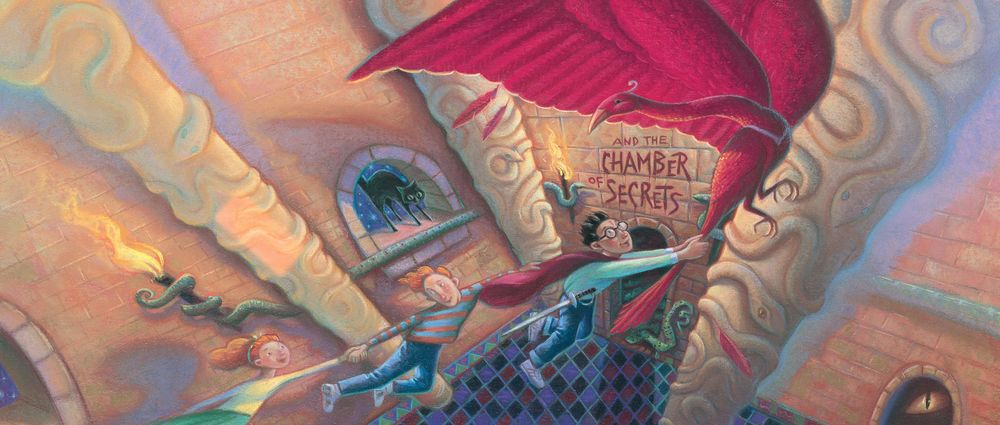
But look at the full version. That’s the phoenix’s wing. That’s its whole-ass wing. Why’s this phoenix got one huge-ass wing, and one wing that–as I realize only now–is not even extended, and is just flat at its side?
“But Joi,” I can hear you saying, “there are many examples of artistic depictions of birds in flight whose wings are not extended and/or malproportioned, particularly in this famous medieval illuminated manuscript that I am holding right now!”
And my reply is…yeah I’m just playing around. These covers are great. The weirder the better.
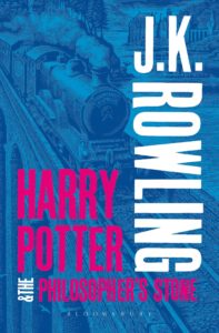
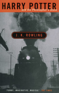
I don’t care for these adult editions. How dull can you get, right? This ain’t Game of Thrones!
This isn’t so bad–it’s got that nice artwork in the background, even if the bubblegum text is blotting it out–but then you’ve got…THEN you’ve got…
…then you’ve got these…..
If I saw this in a bargain bin, I would put more books on top of it. Only then would I leave.
I was not surprised to learn there are boatloads of Collector’s Edition, Gift Edition, and Anniversary Edition covers for Harry Potter…some of them are very nice indeed.
I was a little more surprised to learn there are also unique audiobook covers. I can’t deny how cool this one is:
But most surprising of all is the fact that there are SO many international editions that don’t use GrandPré’s illustrations. Some of these are jaw-droppingly amazing. Some of these are dopey. Most of these, no doubt, have their own warm places in countless peoples’ hearts. Even the really bad ones.

This isn’t one of the really bad ones. I mean, if you look past the Harry in the foreground, there’s a great, dynamic dragon-fighting scene. I just think this one’s funny. Look at this guy. There are CLEARLY two of him in this shot. Why did the artist do this? It’s as if we’re watching a film of Harry Potter’s life, and then suddenly the film pauses, and Harry Potter himself walks in raising his eyebrow, being all snooty (‘cause we all know Harry is snooty), and then he says, “Hm. Yeah, that’s me. Pretty cool, right?”
Leaving this here without comment.
As you can see, there are far too many covers to discuss in one post, so I’ve taken the liberty of examining them (and making more fun of them) in a few more, grouping special editions and international covers.
Now that I’ve read about half of Philosopher’s/Sorceror’s Stone, I can say, it’s pretty good. It holds up.
Stay tuned for–

…
…..
……..click here to read about the sorcery stone! Let the readstravaganza begin!
Reviews:
Book 1 · 2 · 3 · 4 · 5 · 6 · 7 (pt. 1 + 2)
Book Covers:
Special Editions · International (pt. 1 + 2)
Patreon:
(okay, not a book but it’s neat)