Pt. 6.5 of The Harry Potter Readstravaganza
Intro (Pt. 0)
Reviews:
Book 1 · 2 · 3 · 4 · 5 · 6 · 7 (pt. 1 + 2)
Book Covers:
Special Editions · International (pt. 1 + 2)
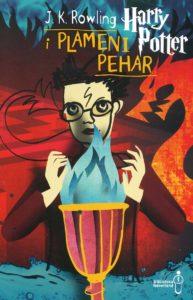
Not too long ago, I ranked Harry Potter Collector’s Edition covers from across time and space. There are some amazing, sumptuous covers for these books. And some bland ones, but that’s okay.
I also missed several. Some of them I missed on purpose, because I honestly get a little bored when I look at a special edition with, say, just the Gryffindor crest on it, or a pre-existing cover illustration in a tiny, tiny box. But here’s one edition that it was a CRIME to miss: a recent American series by Scholastic that I saw in the store the other day. All seven colors string together to form…
This image is from La Gazette du Sorcier, one of many sites that was invaluable to my search for every funny-lookin’ alternate Harry Potter cover. I’ve learned that harrypotter.fandom.com is NOT exhaustive. (More sites I’m indebted to include harrypottercollector.com, alltheprettybooks.net, potterglot.net, and theharrypottercollection.com …!)
While I’m at it, here are some British variants that I like more than I expected to:
You may have thought the special editions were neat…but I think the originals are where the sauce is at. Some of these are tacky, others are classic, and a good many are underappreciated. Most editions of Harry Potter used the British or American cover art from the beginning – not all of them. And there are odd cases where only one book or a few books were translated with unique covers before Mary GrandPré’s work barreled in. No, I don’t know why the American cover art was more widely adopted than the British series; Britain can try not making Harry look like such a goober next time.
Here are my Top However-The-Heck-Many-There-Are* Harry Potter Covers In No Particular Order, which I’m ranking based on the criteria of polish, scariness, and my personal adoration. Let’s forge ahead…in no particular order!
(*They’re endless.)
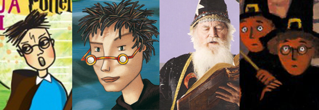
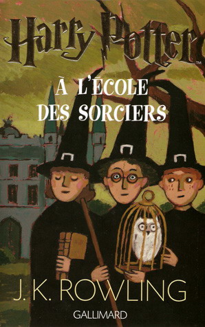
French
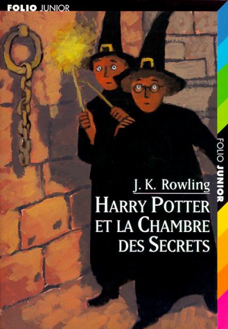
Polish: 5/10
Scariness: 2/10
My Adoration: 7/10
I defy anyone to find a cover cuter than this edition of Phillycheesesteak Stone. Look at those witch hats! They’re adorable! They’re an affront to everything I’ve ever known, but still, they’re adorable!
As you can imagine, these covers had a hard time “growing up” with the series, so to speak.
…Those lips. Are you seeing Hermione’s lips?
My bigger issue here is that the later covers get a little bland, and the color palette gets murky. Still, if I had to choose an art style for the Harry Potter animated series that will likely never exist, I’d pick something in this continuum.
Fun bonus: here’s some rejected cover art for the first book!
Bosnian
Polish: 7/10
Scariness: 3/10
My Adoration: 8/10
Oh my gosh! Speaking of not growing up! So cartoony. So paper-flat. The aesthetic is strong, which is why I’m so charmed by it, but this does like a book that goes on a Disney Channel character’s shelf and nowhere else.
We do transition from the Lizzie McGuire color palette to a moodier one. Some would say Azkaban is where the series takes a depressing turning point, but these editions say Nay, and bravely trudge on with this super-spunky style.
It’s only when we get to Goblet of Fire that it hurts.
And then no more were made. I guess it’s for the best, but…I do have a soft spot for these hooligans.
Russian

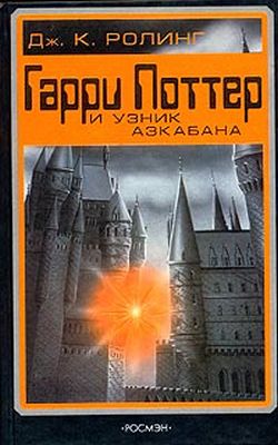
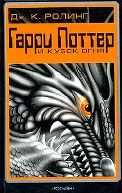
Polish: 9/10
Scariness: 6/10
My Adoration: 2/10
For this edition, the first five books got interesting covers. I’ll accept most of ‘em, but this harshly shaded dragon is where I draw the line. Looks too much like a theme park exhibit.
Also – I’m sorry but WHY is that computer-ass-lookin’ font up there? It makes these look more than ever like sci-fi gamebooks lost in time, only to wash up on the shore of the 21st century. Which rejected them, for the sixth and seventh book covers in this line were not made.
I guess the orange is Halloweeny, but…you can do better. We all can do better than that.
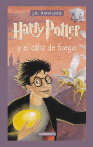
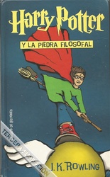
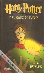
Spanish
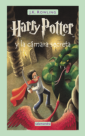
Polish: 6/10
Scariness: 5/10
My Adoration: 6/10
You may be wondering why my scores are so low. “But Joi, these are perfectly fine images, finely painted with masterful craftsmanship, and the way Harry sits on the broom is not even that weird. Why are you not charmed?”
I AM charmed! I am SO charmed! But these two covers are not gonna carry the entire lineup!
Here, take this guy. Lookin’ like a cereal mascot. What kind of strange, vacant groan do you think he’s making in this instant?

What about this one, who looks wide beyond his years?
Spanish (Circulo de Lectores Edition)
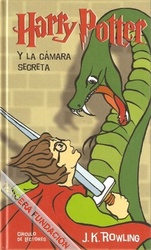
Polish: 4/10
Scariness: 3/10
My Adoration: 3/10
(unless it’s possible to “like them ironically”)
You might look at these and think they’re not bad. Okay, so the leg in the first one is a bit janky, but it’s cute, it’s like he’s pirouetting.
But take…
A look…
At this.

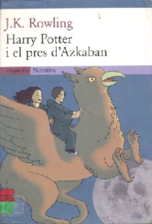
Catalan
Polish: 5/10
Scariness: 1/10
My Adoration: 5/10
Languages that aren’t as widely spoken and aren’t the majority in a country tend to get ripped off with these translations. They get a couple of books or they get no books at all. And in Catalan’s case, they also don’t get great covers.
Here’s the first edition of Sorpeloft’s Stone:
That wizard is a stock image. I know this because he’s also on the cover of this thing:

Forget the mystery of the unknown wizard on the back of the British first edition – we gotta find out who THIS guy is! He’s so mystical he jumps between book series! We’ll never catch him!
The second edition was a little better.
Catalan (Adult Edition)

Polish: 7/10
Scariness: 2/10
My Adoration: 1/10
I figured I had to throw this in because while I find the first one immensely uninspiring (like lots of adult editions) …well…there’s something delightful about the second one.
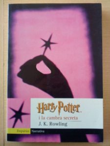
It’s for Chamber of Secrets. So simple. So irrelevant. Someone holding a tiny little star. They probably took that tiny little star out of the top of a cupcake. To reiterate, they are holding a novelty cupcake topper.
It just reminds me that magic is real in the world.
Armenian
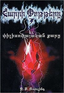
Polish: 8/10
Scariness: 5/10
My Adoration: 6/10
Badass! If the typical adult editions looked more like this, I’d be…well, I still wouldn’t be sold on them. But I’d look at them and think, “Dude, that’s so metal.”
Apparently this was an unauthorized release of the first book, which has a lot to do with why only one book was released. What was the second gonna be, a snake with thunderbolts charging out? Dude! Come on! Why didn’t our universe make that real for us?
Danish
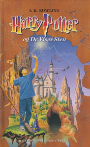
Polish: 7/10
Scariness: 7/10
My Adoration: 7/10
These books get average marks across the board. For every strength, there is a weakness. We begin to see this with the very first cover. Blue and orange certainly are complementary colors, but dull periwinkle and mud brown, not so much. It’s the kind of color palette that makes me think of, for whatever reason, the Great Giana Sisters on the Commodore 64. (The Great Giana Sisters were definitely never intended to resemble the Super Mario Brothers.) I dunno. Something about it screams “European knockoff” to me somehow…it’s uncanny.
“’Just a little closer,’ said Harry as his broom petered along at five meters per hour. He could see the vicious snake from the Chamber of Secrets breaking out and terrorizing Hogwarts, a calamity he could have stopped if his broom were any faster. Actually, he couldn’t see it, for Hogwarts was profoundly foggy.”
“She fell to the ground with a plop.”
This guy needs to stop laughing on set.
One listicle describes this Deathly Hallows cover as “Bill Gates and the Armies of Narnia.”
Still, y’know what? These covers aren’t bad at all, and they’re charming, in the way that my very serious uncle is charming. These are pictures not quite like anything I’ve seen before, and the weirdness is one of the things that gives it that power. (They’re also amazing on a technical level…you can’t go too wrong with professional and realistic painting.)
There are a couple more Danish editions to cover:
Danish (Special Edition…I think?)
Polish: 7/10
Scariness: 4/10
My Adoration: 5/10
Went a little heavy on the smoke effects.
Still, at least I could bear to have these proudly displayed on my mantelpiece. Now we’ve come to the book covers that I fear the most…
Danish (Adult Edition)

Polish: 7/10
Scariness: 2/10
My Adoration: -1/10
These are “adult” editions where 50% of each cover is Chicken and Stars soup.
They all look like I Spy covers. Way too enticing for children. You don’t want your kids to come after your book salivating, charmed by the clearly edible stars. I guess that’s why the first book to feature the death of a heroic character looks like a flaming skull dog:

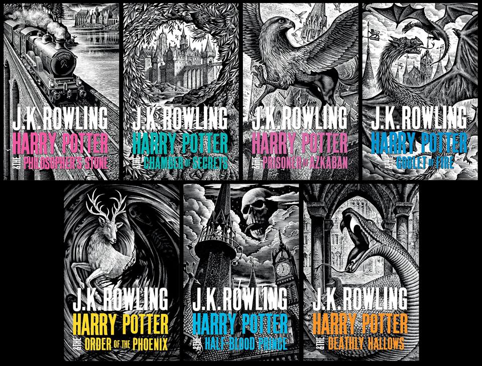
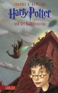
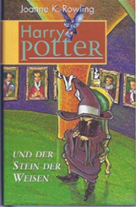
German
Polish: 6/10
Scariness: 8/10
(very existentially scary)
My Adoration: 10/10
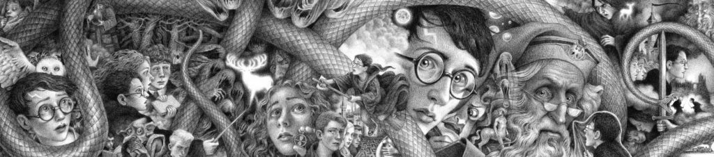
I’ve talked about these covers before (in Part 0 of my Harry Potter Readstravaganza) so I’ll try not to dwell on them here.
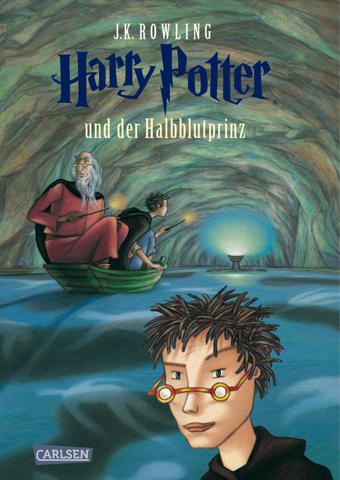

After the first few books, these covers give up ANY semblance of sensicality by showing two Harries who seem to be on the same plane of existence. AND he has a living hedgehog for hair. Well, you can argue that’s faithful to the book – in fact, I applaud the choice to make an unattractive Harry – but it’s an art style that makes his hair look like an alien, a being unto itself.
There’s a rerelease cover for Sillybilly Stone that I think is great on pretty much every level (because it’s super anime)…

…and there are also these alternate covers that take the absurdity of the cover theme up a notch.

“Hey dudes! I’m, y’know, just chillin’, completin’ the final task of the Goblet of Fire. What, me worry?”
“Yeah, that dragon just fuckin’ died. I think my principal just died too. Pretty cool, huh?”
German (Weird Reader’s Club Edition)
Polish: 7/10
Scariness: 6/10
My Adoration: 6/10
…Just gonna put this here. What a weird and static scene to choose for your book cover, right?
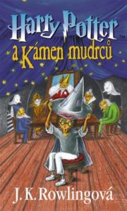
Czech

Polish: 5/10
Scariness: 5/10
My Adoration: 6/10
Seeing covers from around the world interpret the world of the books without the movies as a convenient go-to is very interesting. It’s like…sometimes it’s like…a car wreck. On one level, they’re interpreting an imaginative work in imaginative ways, which is a beautiful thing, and should be cherished. On the other hand, I wonder if they were going, “They do magic. Magic? Stage magicians. Give them all witch hats with pilgrim belt buckles. Boom. Got it. No more work to be done here.”
Putting the lips on the top of the hat rather than the front, and for that matter moving the Sorting Hat ceremony from the great hall to Dumbledore’s stupid attic, were bold moves. But they’re not moves I necessarily like.
An early reprinting changed some things around, to better fit the movie without totally sacrificing creative autonomy. The first big change is to the title font. Notice it changes “Harry Potter” to match the film’s logo and unify the brand; this happened to a whole bunch of editions. The second big change gives Harry a new outfit, which is good, because in the climax of this book he has to go on stage with Elvis.
As I said, many international editions started out with unique artwork but switched to the British or American jackets partway through. Those weren’t without their changes, though.

May I say that I HATE, HATE, HATE looking at this cover – not because I hate the art itself, or the fact that it usurped the creativity that was once so proud in Czechoslovakia, but because it’s so uncanny to me? When you grow up with a certain edition of Harry Potter, everything else is just off. This version of Azkaban is just close enough to the one I grew up with that the result is firmly in the uncanny valley. Who made the font pink? Is it just the camera quality that made the rest of the cover so dark, or is it really like that?
It gives me the same feeling I got as a kid when Beckett Pokemon Collector did an article on bootleg Pokemon merchandise. Its changes are noticeable enough that despite being official, it has a “knockoff” feel for me. Get this object away from me; I want to sleep tonight.
Asturian

Polish: 7/10
Scariness: 2/10
My Adoration: 6/10
Pleasant, but…not exactly great. Simple and peaceful. Looks a little like Microsoft Paint.
Bulgarian
Polish: 8/10
Scariness: 5/10
My Adoration: 8/10
Here’s something interesting that I missed when I was writing that article on special edition covers. These editions are fairly new, to my surprise – they were released alongside a whole exhibition – and they are extremely cute and darling and, honestly, whenever I look at them I think “I could have made this, that could have been me” – but I digress. Look at Hagrid’s jaunty smile up there. Everyone’s just so happy!
Look at Harry getting his feet torn off by Squiddles. Even when he’s hurt, he’s alright! Even when he’s facing off against Voldemort, he’s showing off his dance moves!
Occitan
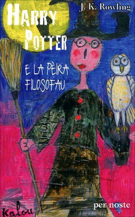
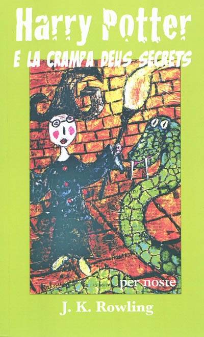
Polish: 1/10
Scariness: 8.5/10
My Adoration: 5/10
(very confused ranking)
Oh no! Speaking of childish! When I say to myself “I can emulate a child’s hand, I could have done those Bulgarian covers just as good,” I look at these and realize they are the more likely result. Putting aside the fact that #1’s got that janky three-font jumble and weird formatting, and #2 opts instead for this garish limey frame while retaining the “grunge” font that is so essential to the Harry Potter brand, these covers are just, uh, weird, and every moment I look I can feel my soul draining.
Look closely at the cover for Source of Misery Stone and you’ll notice it’s actually papier-mâché on some newspaper. I don’t give more points for that. I would give more points in art class, but not here. I…can’t really imagine a store selling this.
Portuguese
Polish: 4/10
Scariness: 6/10
My Adoration: 4/10
The first one is cute, but cluttered…if they’d found a way to fit the composition to the HUGE and CHUNKY-ASS font, it could’ve worked a lot better. The second one is washed-out, or the contrast got pushed up, or maybe their flash was on too high.
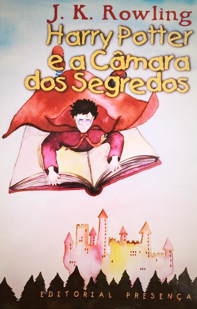
Did you know that this is only ONE of the Chamber covers I’ve found where Harry Potter rides on a book? It wasn’t that big, people…it wasn’t that big!
Italian
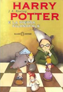
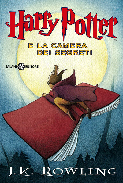
Polish: 6/10
Scariness: 3/10
My Adoration: 7.5/10
These covers are getting points for creativity as well as for mostly-decent composition and a dash of baffling decisions. Exhibit A: Harry Potter wearing a mouse hat and playing a strange but very normal-sized chess game with…uh…Scabbers? Exhibit B: after the films started coming out (hence the change in title font), execs told them “change Harry’s hat,” so they did, and now it’s…uh…it’s a reptile head, which I guess is more thematic. And the flying book. The flying book, man.
Exhibit C: this incredibly interesting image with a cool diagonal composition that did not lend itself to the task at all (the task was to make a book cover; cue soundclip of “you had one job”), and very cool and unusual color choice. Exhibit D: the same exact cool color choice winning my heart again while also spoiling a major plot point! Be thankful that’s not Percy’s body fuckin’ dying in that fire.
This is one of my favorite covers for Deathly Hallows, though – if not for a book on the shelf, at least conceptually. It makes sense that the last cover might be quiet, subdued, and snowy, but also have what is probably some kind of word for “DEATH” on there. This picture is kind of hard to decipher, though. Those are two figures walking away, but they look like a disembodied pair of wings…and I assumed this whole cover was a close-up on a tombstone, but…maybe it…isn’t?
All in all, the Italian covers, for their sheer creative juices and chutzpah, get stars on bars.
Phew…that’s a lot. It takes way longer than it should for me to format these things, and this post is already gargantuan, so…I’m gonna conclude this soon. Think of it like the film version of Deathly Hallows, alright? Or like the Japanese version of the book version of Deathly Hallows (you’ll see what I mean soon).
— Oh, look at that. I concluded it!

Intro (Pt. 0)
Reviews:
Book 1 · 2 · 3 · 4 · 5 · 6 · 7 (pt. 1 + 2)
Book Covers:
Special Editions · International (pt. 1 + 2)
Patreon:
(okay, not a book but it’s neat)
I … didn’t know the Occitan language still existed. I thought it was a purely medieval thing. It’s know spoken by a scattered handful of mostly Catalan speakers in various pockets of southern Europe, per Wiki. I guess the two dozen of them who wanted to read a British children’s fantasy novel couldn’t scrape together the cash for a decent cover artist?
Interesting. All three of those Harry-craving speakers got together one weekend to put that book together. It was a labor of love. I shouldn’t have dissed it.
Oh, and I’m tinkering with Google Translate now, and it seems likely that the phrase from the Italian book cover background is some variant on “the last enemy to be defeated is death.” Nemico is enemy, sconfitto is defeated, and you got the death part. The quote appears in book seven–is your synopsis/review/whatever coming out soon?
It is! I just read the part with Dobby in it. Gravestone suspicions confirmed — although the composition and the way it’s all overlapping still bugs me.
The Bosnian covers are beautiful in that Parappa the Rapper kind of way. I love them dearly.