Some albums, books, or other cultural artifacts look very “of their time.” Others—at least in retrospect—look like downright time-travelers.
And a recent impulse buy has graced me with the most bizarrely timeless cover art I’ve ever seen.
Now, I’m not saying it’s the greatest cover. And I double-checked to make sure I wasn’t actually looking at a nostalgic attempt at some older style. I’m talking about innovation. Innovation so raw it should never have been attempted.
But hey, let’s make this a Top 5 list, just for kicks. A parade of things that I thought were made in one decade but actually date back to another.
And let’s start with some lowballs. Let’s clump together a few examples so easy they might be cheating.
Honorable Mention: General Minimalist-Abstract Category


As long as your font, font size, and color choices aren’t too telling, then yeah, you can slot in here.
Disqualified records include The Velvet Underground & Nico for being too iconically 60s and Yes’s 90125 for being too iconically grey.
I would also disqualify every single Chicago album because I can’t tell those apart to begin with, so they may as well all be archaic. Except for three of them, which I share here just for kicks:

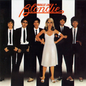
5: Blondie’s First Album

How’d they get the Fast and Furious font in 1976!?!?!?
I would venture to say Parallel Lines from 1978 may also be decently futuristic-for-the-seventies.

4: Perrey-Kingsley’s The In Sound From Way Out!

Either you immediately knew that this was a 60s album or you thought it was a 00s throwback, I wager. This album art was up-and-coming enough that when the Beastie Boys referentially reskinned it for 1996, they didn’t really change anything.

3: Electric Food’s Flash

This is NOT someone’s vaporwave mockup. It’s just a hard rock album that happens to sport garish pink and radiatory elements enshrined by a checkerboard border.
We have reached the point in this list where cover art starts to disturb me. Flash by Electric Food disturbs me.
I wouldn’t exactly say it looks like it came from 2012, because the checkerboard border is so thick, the “flash” is so small with a not-very-modern font, and the colors of the nude lady are oddly muted (and also because she’s a nude realistic lady, not a statue or chipper anime lady). But I guess seeing anything in pastels with checkered prints makes my brain go haywire.
It is also the hottest cover of all time. It makes my eyes catch on fire every time.
2: Bonnie Raitt’s Home Plate

I dunno who Bonnie Raitt is, but she had that “Jazz” paper cup game on lock as far back as 1975.
Now we’re truly in disturbing territory. Bonnie Raitt is clearly transcending time and space, we can all agree. But she only transcended ten to fifteen years in her trip across spacetime. Aren’t there better chrononauts?
Yes, there are. But only a chosen few.
Now we finally turn to my main reason for bringing you here…
The #1 Most Futuristic Cover Art Ever.
It’s the first-edition cover of Why Big Fierce Animals Are Rare: An Ecologist’s Perspective by Paul Colinvaux.

I found this book at a wonderful little bookstore and picked it up for no strong reason. Looking at it reminded me how much I liked the ecological, biological, and cultural essays in The Lives of a Cell (1974) and The Medusa and the Snail (1979) by Lewis Thomas.
Looking inside, I discovered it’s not exactly the same, but it is exactly as old.
This 1978 book is neither hardcover nor distinctly-seventies paper-feeling paperback. It is laminated with minimal wear and tear. It even smells good.
This tiger must’ve been waiting pristinely on the bookstore shelf for forty-five years, waiting to pounce.
The only real tells are the slightly blurry tiger image and maybe the numbers on the ISBN, which aren’t twenty-first-century regulation, since they’re the only things not in Word-Default Times New Roman and the zeroes have crossbars in them.
Yes, it’s brown, but it’s not “seventies brown.” Is it? I mean, it might be a type of brown that doesn’t hold up under sunlight, because the spine is distinctly lighter, paler, than the front and back. So that’s one flavor of oldness. But the color doesn’t scream arcane tackiness to me. It just screams of a tackiness that transcends time.
How could this futuristic monolith possibly have been flung from 1978 all the way to the style guides of 2001? Perhaps because it was published by the forward-thinking geniuses of Princeton, who also released an entire Princeton Science Library around the same time.
But according to a friend, while Why Big Fierce Animals Are Rare looks like it was produced in 2005, others just look like 1985. Each one also seems to have been designed by a different intern. Sorry, I meant “by unified experts.”


So primal.
Anyway, move over, Timeless the future funk album by Desired and every other future funk album cover with a pre-existing anime character on it. There’s a new cover floating beyond the reach of relativity in town.
Thank you for reading, and Patrons, thank you for Patreonning.
For more odd time-islands, watch me watch Blondie movies, watch me watch Fluke movie (there’s only one), or check out me glowering at international Harry Potter covers (several wonderful, some uncanny).
