Pt. 6.75 of The Harry Potter Readstravaganza
Intro (Pt. 0)
Reviews:
Book 1 · 2 · 3 · 4 · 5 · 6 · 7 (pt. 1 + 2)
Book Covers:
Special Editions · International (pt. 1 + 2)
All these book covers were supposed to be a single post, but there’s just…so…..so durned many. If you missed our first batch of covers from around the world, go here first. Well, here we go!
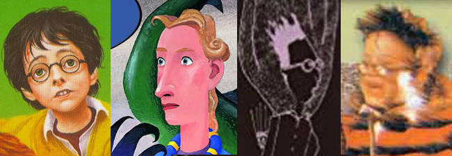
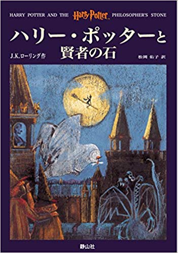
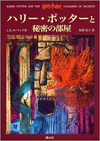
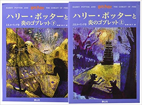
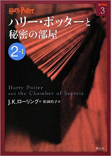
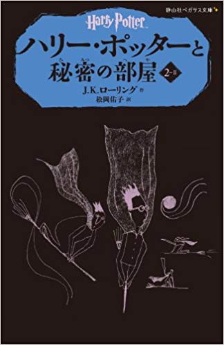
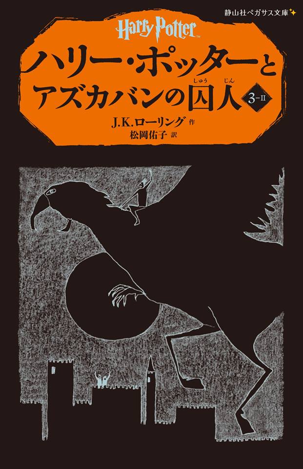
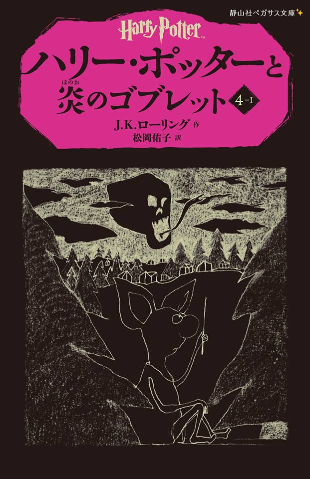
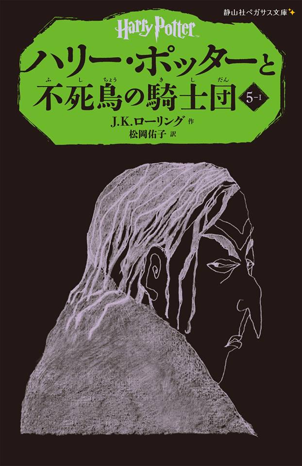
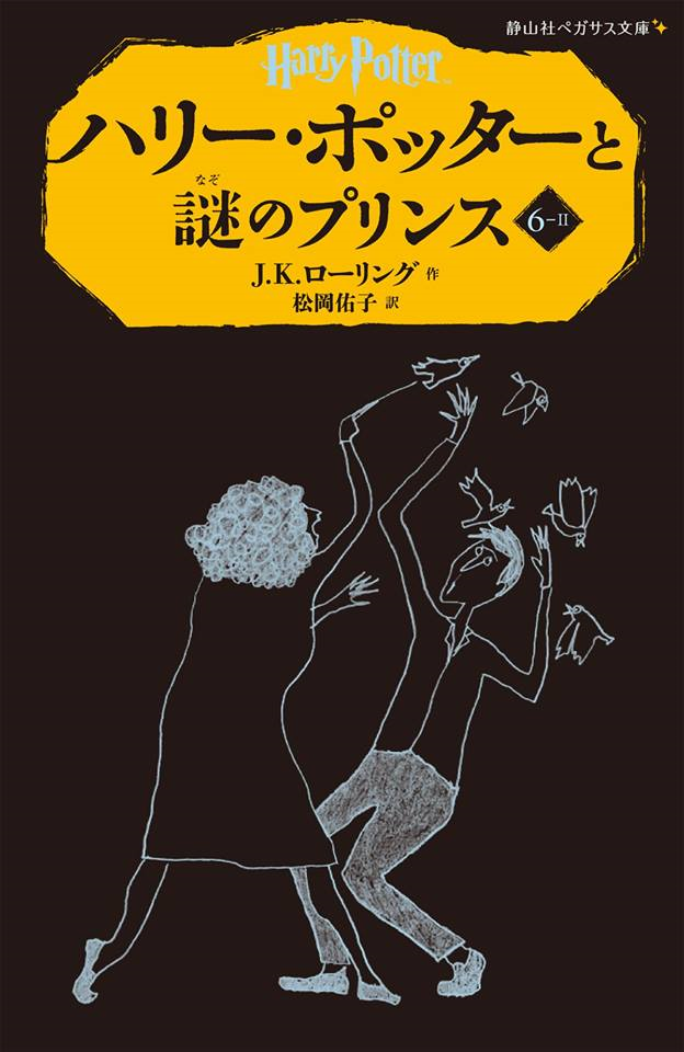
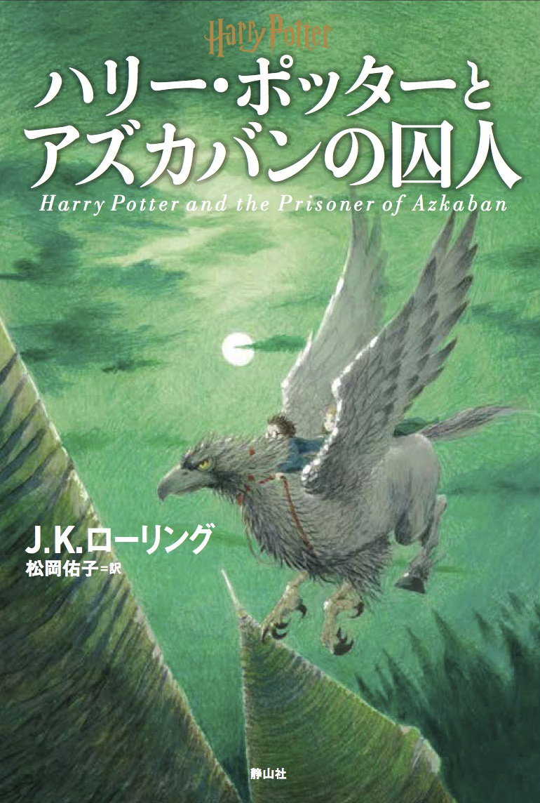
Japanese
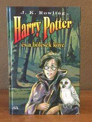
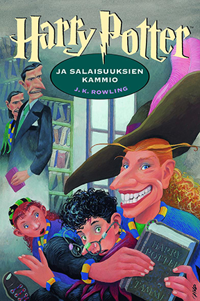
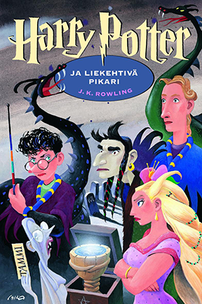
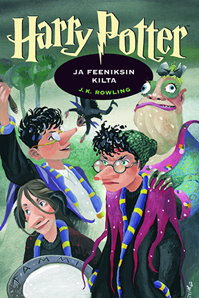
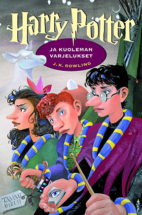
Polish: 7/10
Scariness: 7/10
My Adoration: 7/10
I feel like I should adore these covers more. Some of them are really good, like the Phosphorous Stone cover above.
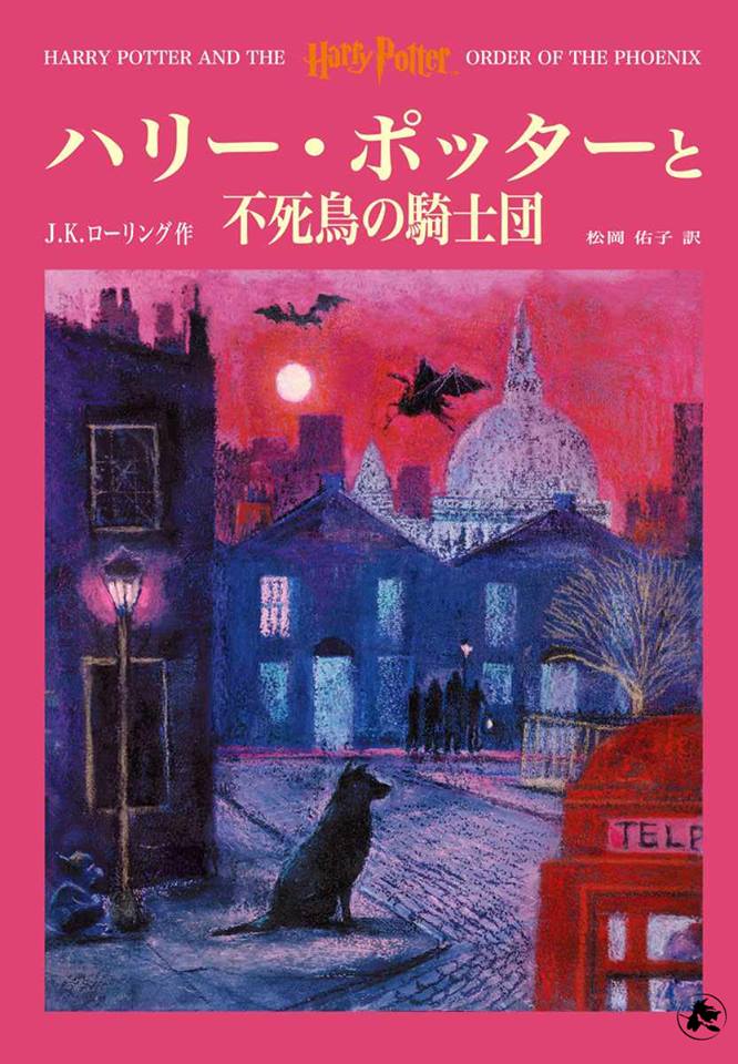
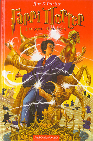
And this one for Order of the Phoenix is one of my favorites for that book EVER. It brings together images beautifully: 12 Grimmauld Place, Sirius looking noble and expectant, a Kreacher that I only noticed just now…and some other things that you can find on your own time.
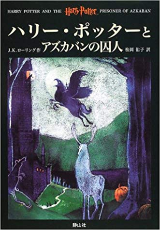
But I think it’s the fact that they’re so quiet and subdued that makes me less partial to these. For as moody and atmospheric as they can be, other covers are smaller-scale, less exciting, and, y’know, just there, in my book.
Fun fact: because of the way longer books are often sold in Japan, the later books have TWO covers, gracing a Part 1 and a Part 2. You’ll notice two Goblet covers above, for example.
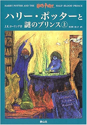
Japanese (Adult Edition)

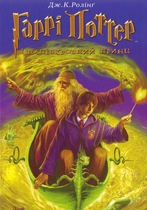
I hate these pieces of shit. They look like textbooks. Especially this one for Half-Blood Prince:
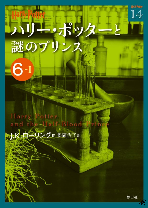
You see, they do a lot of potion-mixing, so on the cover they have test tubes. TEST TUBES? WHAT COULD BE MORE MAGICAL? OH, I FORGOT, ADULTS DON’T LIKE WHIMSY!
Japanese (Some Kinda Weird Edition)
If there was ever going to be a series of animated Harry Potter short films, I’d pick this artist. Their style is simple but neat – self-assured – and could probably put a hurtin’ on some Shel Silverstein collections. There are a full fourteen covers in this set, since every book got split into two parts…so there was a lot to choose from, ranging from the slightly boring to the appropriately whimsical, yet haunting:
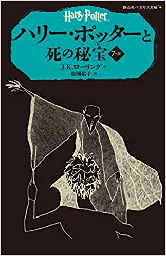
I love the Phoenix one with, if I had to guess, Snape’s stupid face on it. It’s the perfect sneer. You can almost hear him going “…eugh!”
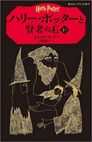
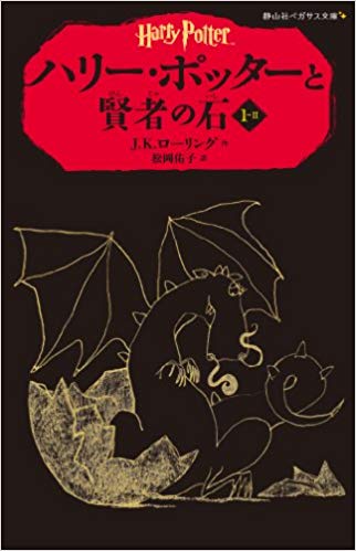
Japanese (20th Anniversary Edition)
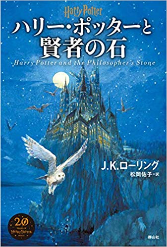
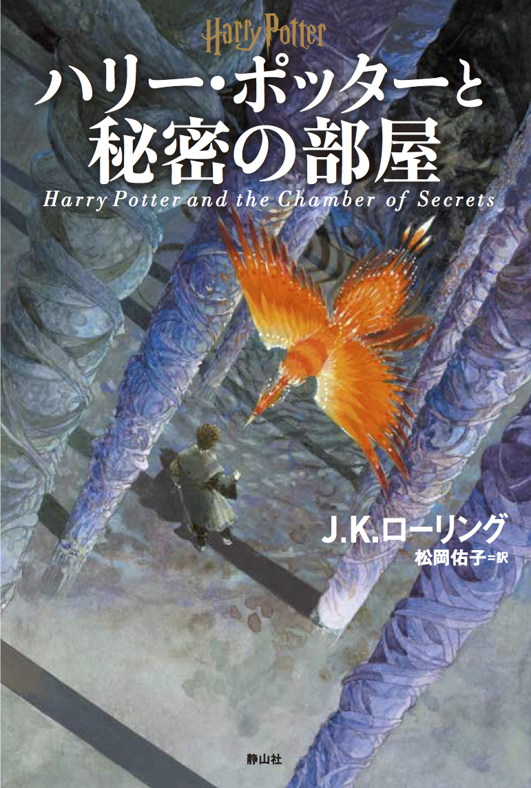
Did I miss this in my Special Edition Covers blog post? You bet I did. It, like many others, wasn’t on the Harry Potter Wikia cover page. Now I’ve seen the truth, and I can go farther than I ever imagined…
These things are gorgeous. I have no complaints, except maybe about the awkward dead spaces. I love how you can see the strokes, yet it’s all immaculate, unsloppy. And the more you look at the ground in the Chamber of Secrets cover, the more tantalizing it becomes, like a wavy optical illusion.
Japanese (Magical Wheat-Strand Edition)
Polish: 0/10 (I hate it)
Scariness: 0/10 (I hate it)
My Adoration: 0/10 (I hate it)
It’s not actually called the “magical wheat-strand edition,” but it may as well be. Every volume looks like this. I hate it.
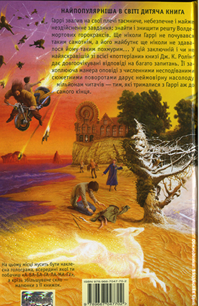
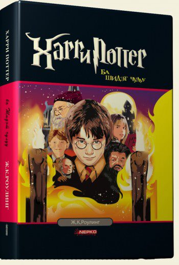
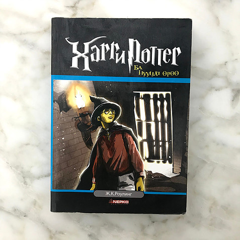
Ukrainian
Polish: 8/10
Scariness: 9/10
My Adoration: 10/10
If this cover were a game, it’d have 60 hours’ worth of content. There is so much going on, and it’s all equal parts horrific and delightful. That’s why I made this picture extra-big; you’ve gotta see the details. You’ve got Harry Potter looking like a snot-nosed pissant reaching delicately for the Snitch. You’ve got Dumbledore the height of a tower – no, literally the tower – holding that book like it’s a diary with a giggling face that says, “Don’t you touch this! Don’t you do it!” You’ve got Ron holding that chess board like it’s his wallet, just holding it really far away for some reason. You’ve got Hermione and her books. You’ve got McGonagall and…another book. I dunno why almost every teacher got books, but I’m glad Snape doesn’t have any, because I’m sure he doesn’t deserve them. Little witch kids. A tiny baby dragon. A gradient in awkward, vomit-like colors that screams “the Great Giana Sisters.” Now that I’ve seen this cover, I can die happy, knowing how vibrant life is.
Oh, and you’ve got the back, too, just in case you doubted that the artist had spent any time on this:

So busy! So gaudy! So full of life! So uniquely disturbing, and yet innocent! It’s like…
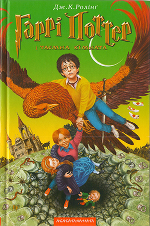
Look…if you can’t fuck with these covers, I’m not sure we can be friends anymore.
You might assume that these covers had a difficult time “growing up with dear little Harry,” but you’d be wrong, wrong, SO wrong. Look at these things and tell me you don’t feel like a bully who never imagined the runt of the litter would grow up so big and strong.
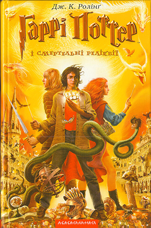
Amazing. You may despise the early covers, but I hope you will admit – that Deathly Hallows cover is pretty bangin’. And it’s got fuckin’ wizard War of the Worlds on the back.
And look at this! They almost did it! They sort of almost planned it out! Yes, I adore these things.
Dutch
Polish: 8/10
Scariness: 7/10
My Adoration: 5/10
I’ve never seen anything like these, but I can’t say I ever wanted to. (Woah, look at how big Hedwig is!)
I think these are uniquely tacky. They feel small and busy; polished and reasonably well-produced, but cheap. They remind me of the original DIC logo, or the advertisements for the early morning edutainment shows that nobody watches. It’s hard to explain, but when I look at these, some chump kid’s voiceover comes on in my head telling me to watch something at 8 PM. I guess that means they’re nostalgic? Gross.
Maybe it’s the fact that they’re cramped and have a bit too much information – namely, that thing at the top? If you’ve read this book, you know exactly why they’d choose a profile of a tiny rat for the icon at the top. (As for the things at the bottom – the cardboard cutouts that are gradually falling over – we can all agree, they look too pathetic to be dementors.) But if you saw this on a shelf, would you really grab this saying, “Oh, cool, not only a hippogriff, but also a profile of a rat?” Also, did you notice that motion blur? Also, did you notice that lava-lamp moon?
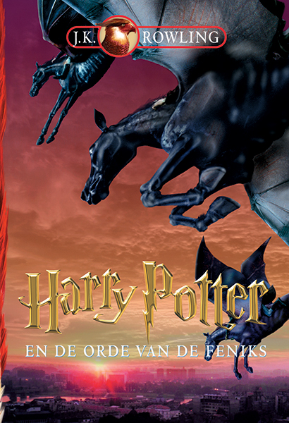
I think the Order of the Phoenix cover is pretty cool, though, since it’s more subdued and the Photoshopping job is less distracting. It’s ominous and quiet in a way that most covers for this book aren’t, to me.
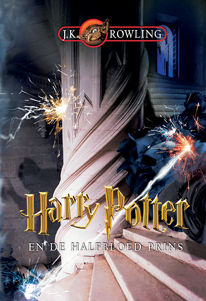
But, okay, look at this shit for Half-Blood Prince. On the one hand, this is kind of amazing; the photorealism gives it a unique energy, like the whole thing’s in motion and sparking right in front of you. There’s so much movement, and I don’t mean dinky motion blur movement either.
On the other hand, this is so silly. That’s clearly a bedsheet hitting…a stair…as Nosferatu’s silhouette comes walking up, and then some other sparkly energy bomb hitting this pillar. But the more I look at this, the more delighted I am. That might be a dementor (or something…I don’t remember seeing fighting, magic-blasting dementors anywhere in this series yet), this image gives me happiness.
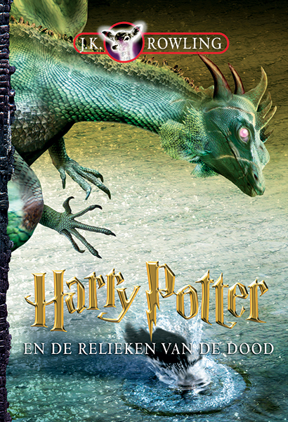
And, uh, this dragon. King of the sillies. Why’s he sticking up one leg so we can see his kneecap? For that matter, in what direction is he flying? The neck implies “straight ahead,” the hands imply “I wanna grab whatever just fell in that water,” the eye implies “fuck you, stop asking questions.”
There’s something about this cover, specifically this dragon, that I hate profoundly. That’s why my adoration is a solid 5 for this cover series; I’m caught between delight and despair.
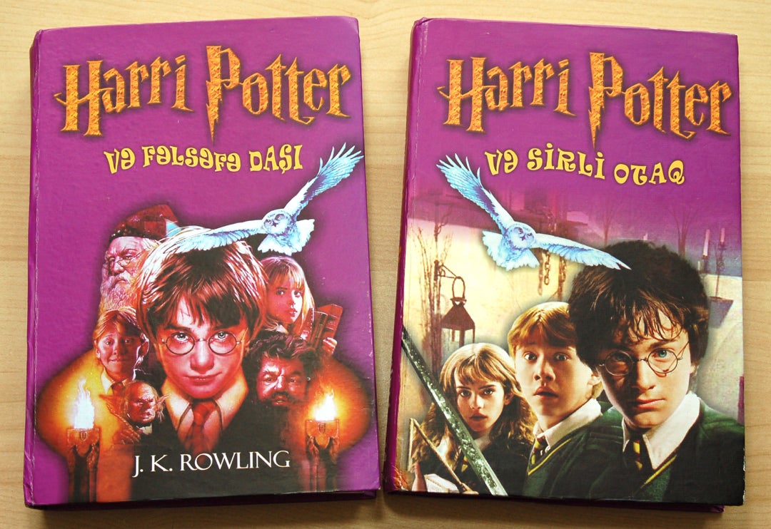
Azerbaijani
Polish: 8/10
Scariness: 2/10
My Adoration: 3.5/10
Oh my gosh! I forgot I’d seen this! That kind of says it all, don’t it?
Azerbaijani (Unauthorized…maybe?)
Polish: 6.8/10
Scariness: 2/10
My Adoration: 7/10
These are a little more fun. I like how the font and overall design, beyond the movie poster pics, is half groovy, half Girl Power.
Breton
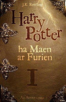
Polish: 9/10
Scariness: 3/10
My Adoration: 3/10
Yeah, let’s get this out of the way. It looks classy – TOO classy, I would say. Where’s the fun at?
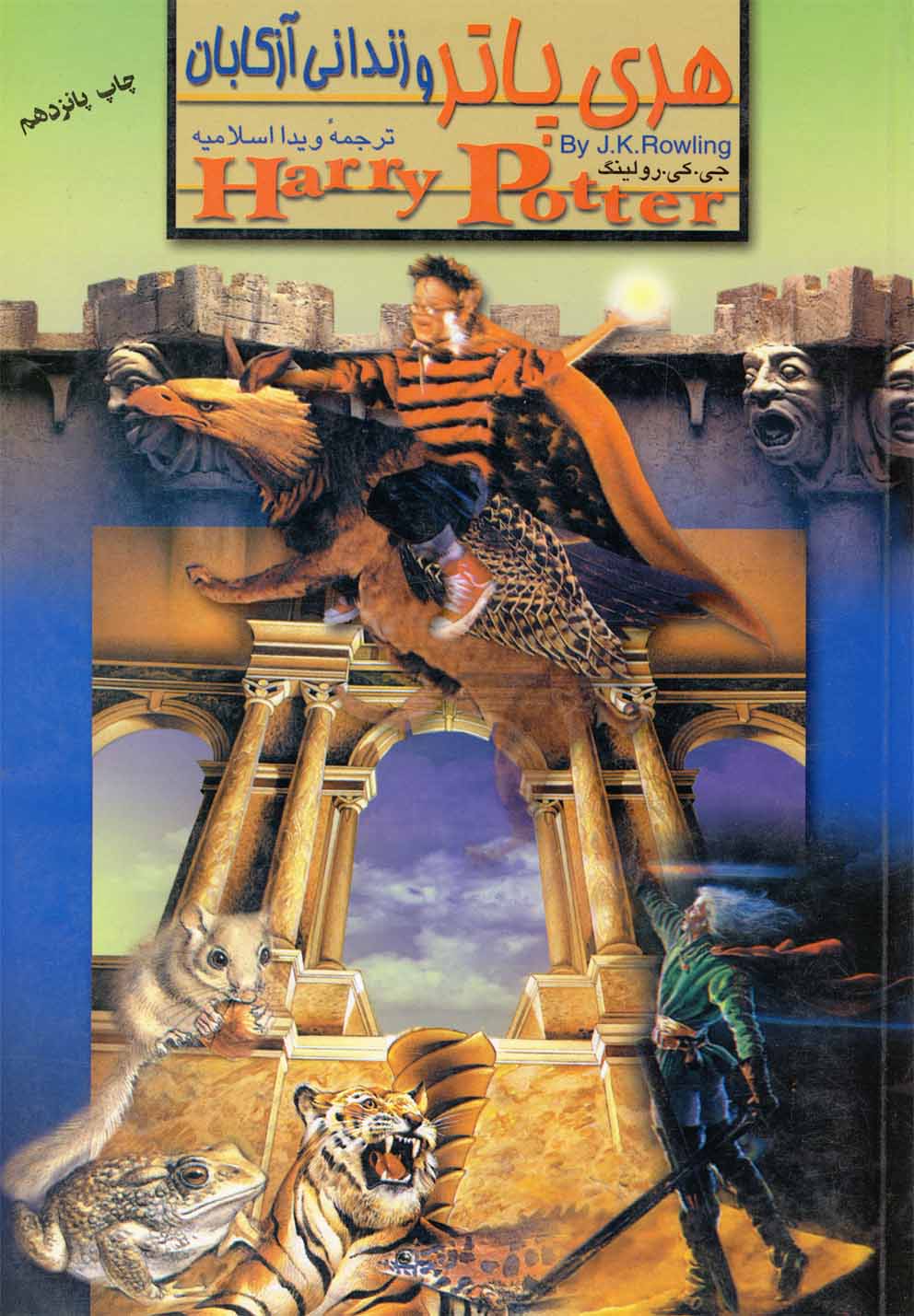
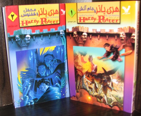
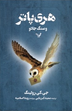
Farsi
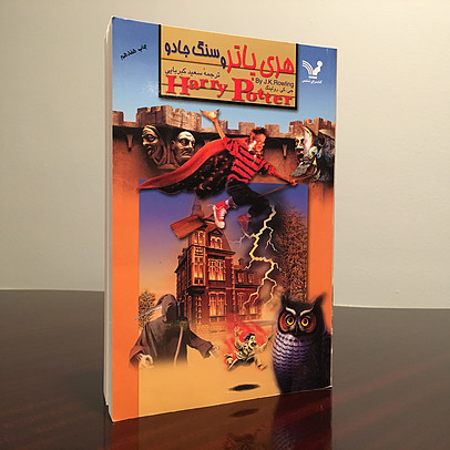
Polish: 7/10
Scariness: 5/10
My Adoration: 10/10
Now, if you can’t fuck with THIS cover, I can’t even see you on the street without gagging. It’s amazing that a layout that suggests to me math textbooks could be the host of such an adventurous cover. Look at Harry raising that Snitch; it looks like he’s summoning the bolt of lightning that set Groucho Marx on fire. And that huge cape. We gave him too much power. A strangely faded Grim Reaper. A strangely massive non-snowy owl. A very small Hogwarts. Eerie stone faces on castle parapets that, oddly enough, are both unique to this cover’s interpretation of Hogwarts and appropriate for the setting.
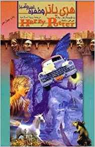
Sorry for the lower quality – again, these were tougher to find. This one seems to be for Chamber of Secrets, as you can tell by that car and its, uh, butterfly wings. Hey, the book never said the Ford Anglia DIDN’T sprout butterfly wings midway through its flight. I love that Harry at the side screaming, “NO!”
But my favorite covers here are the ones with the little magician soaring at the top, unchanged and unaging. Ageless, because he is immortal. Riding the dopiest hippogriff I could ever imagine, he has gone from holding the Snitch to straight-up charging his energy blast. That white-haired dude cruising out of the black mist is, I have to assume…Sirius?…and then there’s an assortment of animals in front of an ancient Roman gateway. Unless that tiger is Crookshanks? Amazing.
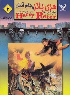
I…can’t even describe what’s going on here. I think this is Goblet of Fire, so it must be Harry completing a trial, but he seems to be in the Cretaceous Period, and in the background is a fifty-foot-tall man breathing fire to ward off the foes who want his Tree Star. Right? I’m seeing this right?
The one on the left here is actually some amazing use of Mary GrandPre’s cover art for Phoenix, incorporating it pretty well into the textbook-like frame. I like the use of yellow a lot.
(People with keen eyes and/or knowledge of the number system used across these covers will notice that the numbers in the top-left corner don’t really match up…when they’re present at all. Are these legitimate? If so, which ones? Or were there weird reprintings? Collections? I…I don’t know! Help me!!)
Farsi (Special Edition, I Think?)
Polish: 8/10
Scariness: 0/10
My Adoration: 5/10
BOO! It’s good, but BOO! It can’t top what I’ve just seen! No, don’t show me more – I don’t care! We’ve seen the cream of the crop! Nnneeeeext!
Mongolian
Polish: 8/10
Scariness: 4/10
My Adoration: 5/10
This is kinda weird, innit? The first cover looks like a rasterized version of the first movie’s poster, which is…fine. It’s tasteful. The second looks like Sin City.
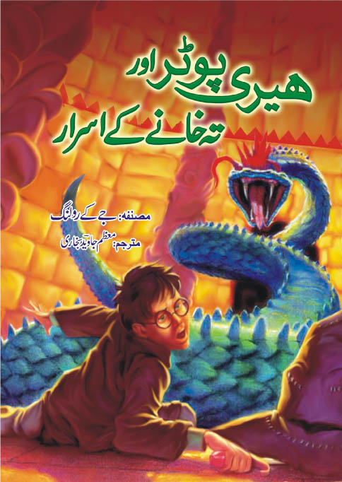
Urdu
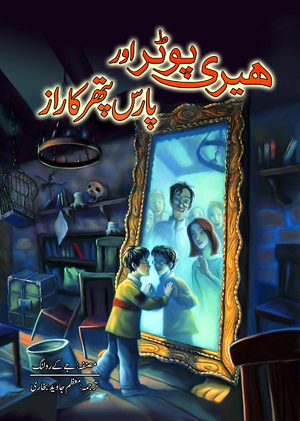
Polish: 7/10
Scariness: 3/10
My Adoration: 7/10
From what I can gather, these books aren’t authorized translations, but holy SHIT is that art cool. Look at the first book up there and tell me it doesn’t look legitimate. Cool! Coooool!!
This one’s also great, but kind of weird. Harry’s fallen and he can’t get up!
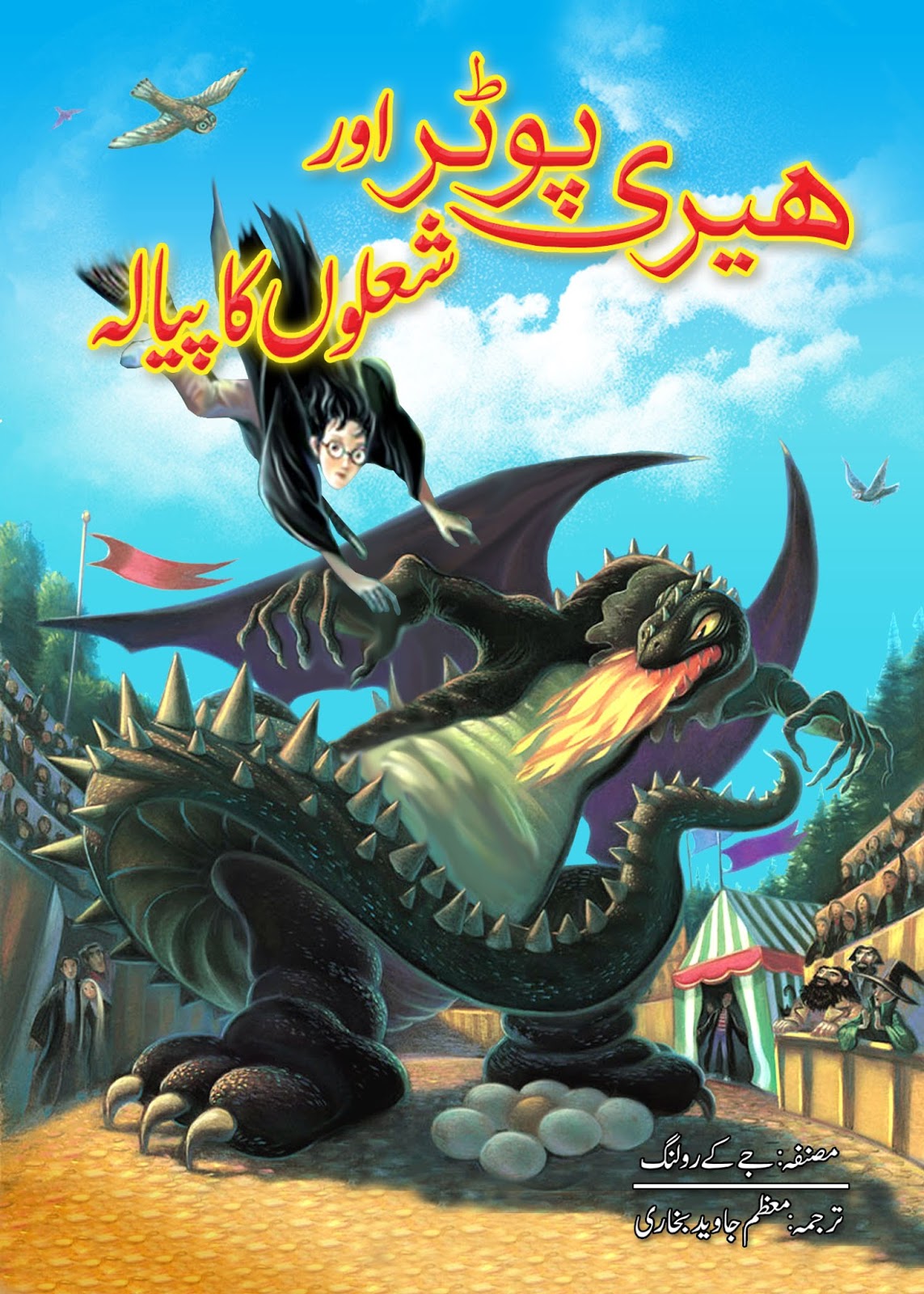
And this one’s a little off-putting. The dragon’s contorted in an unnatural pose, and he’s got spindly delicate fingers, so he’s stomping forward like a linebacker who is also unexpectedly a hand model. Why’s the tail wrapped around him like a baby blanket? And wasn’t the tent closed in this part of Goblet? All the same, this is a unique and darling cover.
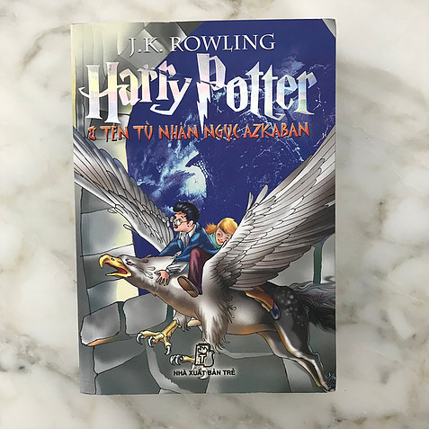
Vietnamese
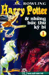
Polish: 7/10
Scariness: 2/10
My Adoration: 7/10
I like this for the sheer guts. The Vietnamese kid’s book market must be unique, because what you’re seeing isn’t the first book, but the first volume of the first book. It was split up into seven:
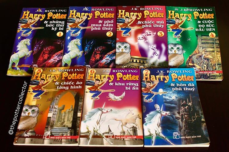
To repeat, these are all seven parts of the first book. (Or, that’s what I’m told. Someone who can read the titles of all the books pictured can confirm or deny.) And there’s a few odd choices here. The titles and the silly Harries waving at you are the consistent things. Then there’s an animal friend that changes (that’s still not a snowy owl!), a colorful border element that changes every time (take another look at the first two…the change is subtle), and a background image that changes every time (again, take ANOTHER LOOK at the first two…the change is subtle). The cover artist/s seem to change their minds at a few points.
Also, isn’t that dude from The Dark Crystal? What the heck? These are all tracings or stock images, aren’t they?
Those ghosts immediately make me think of the Ghostbusters music video from this game called “Stepping Selection.” Very beautiful…
The art on these gets somewhat better – when it isn’t just tracings of the American cover art. Even then, it has those distracting thick outlines that never fail to make me think of educational paperbacks that kids write in to practice handwriting. Yes, that was an oddly specific thing for me to say.
Hungarian
Polish: 5/10
Scariness: 6/10
My Adoration: 6/10
It seems that Hungary only got one original cover before switching to conventional cover art. Alltheprettybooks.net said it best: this font’s got some serious Indiana Jones vibes.
This cover is charming, but supremely awkward, and the color choices are a little weirdly muddy too. I think Hedwig looks kind of misshapen and…moldy. Still. Still!
Hungarian (Uh?)
Polish: 6/10
Scariness: 3/10
My Adoration: 6/10
I don’t know what this is (because I didn’t go through the effort of typing the text at the top and translating it). Probably a kid’s edition? Maybe something for a book club? That would all explain the style here. It’s cute, it’s nice, it looks like an Arthur book, it would be at home next to some Mercer Mayer…I have no more to say.
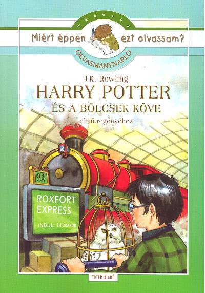
Icelandic
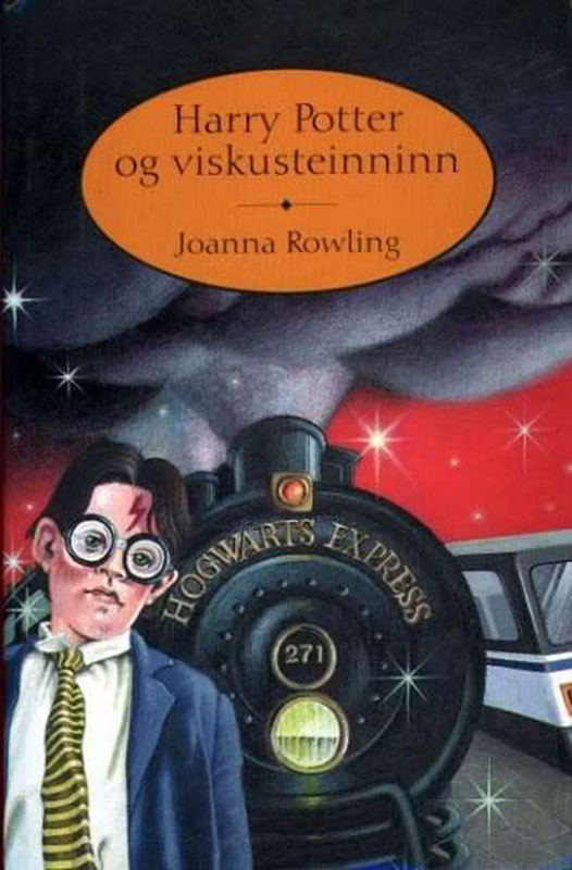
Polish: 4/10
Scariness: 7/10
My Adoration: 8/10
Holy moly! I could write an essay on this cover and the ennui it exudes. Suffice it to say that Harry Potter looks beautiful on this one.
It’s almost interesting that there’s a standard newfangled train right next to the steam locomotive that is the Hogwarts Express, and in that context it’s also almost interesting that Harry Potter has just loosened his tie after a long day at the office. But it’s not taken very far, so what stands out the most about this cover is…that face. And those ruddy mulberry cheeks. That face.
Finnish
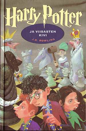
Polish: 7.5/10
Scariness: 4/10
My Adoration: 8/10
I’ve been saving these as you would a secret weapon. Here’s a wonderful, whimsical art style with some interesting but not horrific choices (a neat interpretation of battle chess, the daring move to give everyone Kermit the Frog thingies). Plus, while they might be floating oddly in space just like in the German covers, this layout won’t be repeated ad nauseum throughout the series. What a fine interpretation of the first book!
It’s a pretty good match for the tone of the second book, too. Sure, this is the one where all the students almost die, but it’s still kooky and light-hearted. It does feel like they ran out of ideas for this cover, though. Incidentally, my research tells me that the person grabbing Harry isn’t Mrs. Weasley, but…wait for it…Guilderoy Lockhart!
Wait…I always assumed this scene was at the bookstore, but the Malfoys don’t have black hair! I don’t even know what this is anymore!

I tend to skip the Prisoner of Azkaban covers because they get kind of samey, but this one’s delightful. I love the movement, the way they posed the hippogriff to keep us close-up, and the hippogriff’s stupid-ass vacant face. It’s somewhere between a quail, a duck, and a dead-eyed pigeon. I mean, it’s not “noble” like the book tries to tell us, but…I’m sure it’s got a noble heart, somewhere in there…
Something else clever about this cover is the fact that Harry and Hermione’s faces are out of focus – Hermione’s is especially dramatic. They still have that distinctive massive-nose style, but that style is put aside so that readers know this is The Moody Book (uh…insert joke about it not having Mad-Eye Moody here).
Then we get to Goblet of Fire and, um…the weaknesses are showing, I think. I mean, I like how the whole ensemble is here in clear view ready to face off, but two of the Triwizard Tournament competitors are staring off into space, so I don’t think they’re exactly “ready.” And there’s Moaning Myrtle in the nude, ready to put TAMMI’s name into the goblet (that’s the publisher’s name, which is slipped into every cover, but y’know…it’s a bit too odd for me).
Those two dragons are a lot of fun even if they do look real stupid. The gravestones are really fighting for space. Lastly, Harry’s four-colored teacherly pointer is pretty fun, and his stern expression makes the most of a bad, silly-looking situation. Like he’s saying, “Hey, everyone, THIS book’s moody TOO!” The cramped composition and the cartoony art style that we’re now forced to ride out ‘til the end are backfiring here. This thing’s a mess, and the hazy-grey background attempts to set a darker mood that’s not really coming across.
And then everything just falls apart, as far as I’m concerned. Look, what is this? You don’t have a chance of understanding this cover unless you’ve read at least two-thirds of Order of the Phoenix. There’s Harry and his frogmother, who has gifted him a delightful froghat, and in the background is, uh, someone, we can’t even attempt to guess. A duplicate Harry is waving at the frogmother, and in front of him is Lady, who is carrying a large TAMMI tablet.
After a long night of thought, I was able to decipher that the frogmother is actually a too-literal translation of Ms. Umbridge. The second Harry is James Potter sending Professor Snape flying, and the TAMMI tablet is probably Sirius’ mirror. I say “probably” because I guess it could also be the Pensieve with some white thoughts in it? Anyway, I can’t explain the frog hat, and I don’t know who that smiling Lady is. I’m sorry for failing you.
Yo, I’m not gonna mince words. This cover is a disaster.
It’s cute how everyone’s wearing eyeshadow for this Deathly Hallows cover. And hey, I can tell who everyone is on sight this time! Even if Hermione is wearing a lily and Ron is wearing a flowerpot – oh, wait, that’s a hill with a pathetic grave on it.
It looks like Harry is holding the mirror shard with an eye in it (I’m saying this as someone who’s only read half of Hallows as of yet). Ron is holding a funny little sword handle, but that can’t be the Sword of Gryffindor because it’s so new it’s still got the price tag attached. (And might I add, he’s wearing a really smart plaid shirt.) Hermione is holding…nothing…because she’s fading away and clearly becoming one with the curtainy things in the background. I wish I could adore these more, but, a little like the movies, these lost wonder and color somewhere along the line. It’s like I just watched a car wreck, but a slow and mild one.
Uighur (Authorized…?)
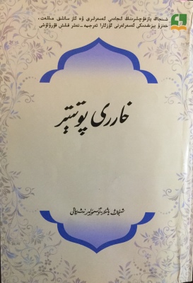
Polish: 10/10
Scariness: 1/10
My Adoration: 1/10
I tried to go for completion here. From what I can tell, apparently this is indeed an official release.
Uighur (Unauthorized)

Polish: 7/10
Scariness: 3/10
My Adoration: 3/10
This one’s not! This one’s definitely not! That’s art from one of the video games!
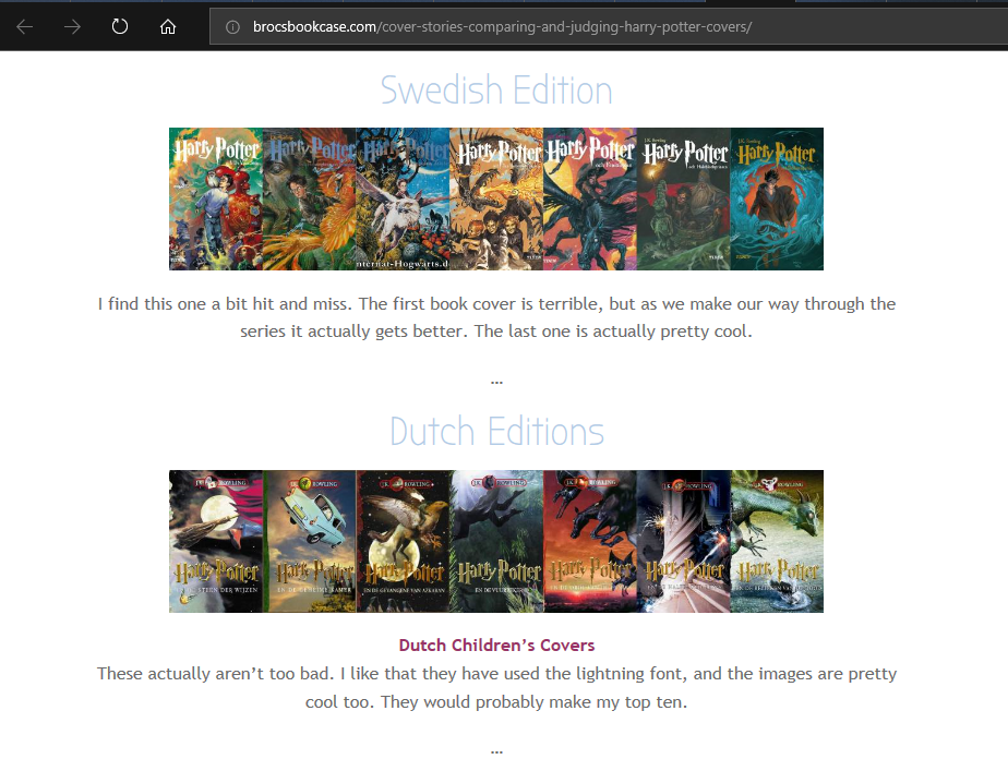
Swedish
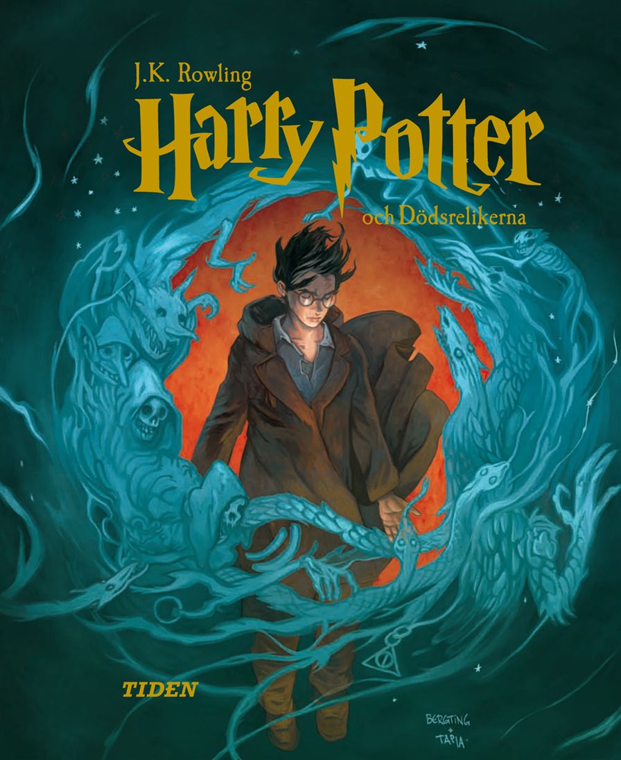
Polish: 9/10
Scariness: 4/10
My Adoration: 11/10
We’re going out on a high note. I started with the seventh book from this release because, while it’s astoundingly good, I feel like I’ve seen it before – to be precise, I feel like I found it in a webcomic somewhere. I also hear it was a collaboration between the longtime cover artist and another artist, which might explain that. But have a look at these…
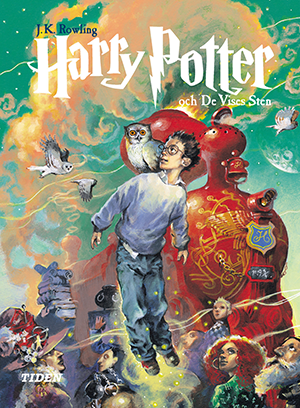
Who thought of this, and who approved it? For one, this Harry is the mangiest I’ve seen in all these covers – who wants to pick up a book with such a scraggly kid on the cover? He’s clearly wearing baggy hand-me-downs, his hair is wild, and even his face is a little strange – just like in the book.
They went above and beyond in showing an extraordinary world. That’s a fruity, bulbous-apple Hogwarts Express, and it goes wonderfully with the teal sky and yellow-peach clouds.
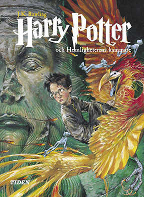
Here Harry is perched on a…almost falling off of a phoenix in the Chamber of Secrets. The movement and ambiance here, the playful sprites (or whatever they’re called), the empty eyes of Harry and the statue – the emotions going in every direction – they make a scene all its own that’s not quite in this book, but, for me, captures the unease and paranoia in Chamber. …It almost makes me wanna read it again.
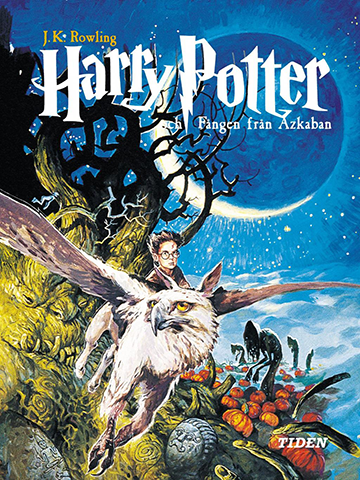
Prisoner of Azkaban is, unexpectedly, brighter than the last one, and I can feel the hippogriff gently cruising through the night here. Notice how the clouds fade into earth and the moon seems to be sending out rocketing beams. I like the colors here especially, and the way the whites and yellow-greens glow.
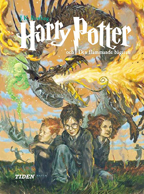
This one’s funny. It takes “entire scene in a cover” to another level. Everyone’s running away with their shoes on fire, and even Ron is fed up, but Harry here is posing like a badass.
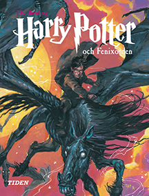
Here he is doing even more superfluous posing. Come on, Harry, hurry up! Your godfather is dying right now!
This cover is a lot simpler, but the reds and purples and yellows and the zigzaggy pose of that thestral work together to make something really dynamic.
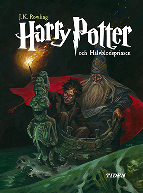
And then this one is, I dunno. Harry and Dumbledore riding that boat. It’s so dark…it’s so realistic…it’s a great rendition of the scene and all, but I just wanna go to sleep when I look at it.
BUT STILL!!!!!!!! These covers are astounding. I would even call them breathtaking. They take risks, and they push the boundaries of their color palettes. They’re painterly as hell. Something else I think takes these over the top is how wide they are – nearly square. They make great use of the space, and it gives me the impression that these are no ordinary books.
In short, it would be an honor to have these on my shelf.
In Conclusion
I’ve thoroughly enjoyed perusing all these different Harry Potter covers, as well as coming across the opinions of others.
I’m sure I’ve missed a few, too. That always happens. It’s bound to happen when you have a series as prolific and popular as this. If there are some covers I’ve missed that you love or hate, send them to me; I’ll bring it up at the start of my Deathly Hallows review. My blogging journey with Harry Potter might be coming to a close…!
Oh, that’s right – I still have some cool Harry Potter stuff to show off. When I was looking for cover art, I found out that Olly Moss, the artist behind one series of e-book covers (you know, the one with the “optical illusion” theme), released some rough drafts of the final cut…
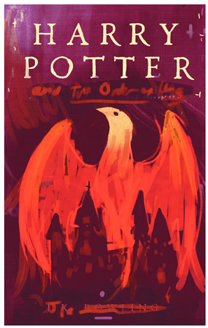
…as well as some rejected rough drafts:
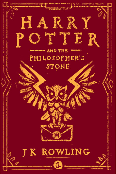
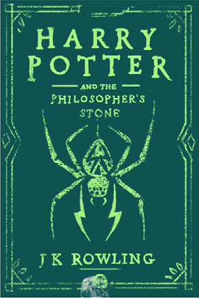
I love the ones we got, but there’s something special about all of them. The scene moving through Diagon Alley is something special; I’d kill for art skills like that. And I love the idea that as the series goes on, Harry holds his head higher. Also, I have no clue where an electric spider fits into this series (emphasis on “electric”), and I guess that’s why it got rejected…but I like it.
Here are a couple of other cool things from around the web I couldn’t resist sharing:
Students in a Brazilian art class reimagined the first book as a fully illustrated pop-up version. You may not be able to buy it, but you can see every page, plus close-ups, in this gallery.
This article shows some whimsical and elaborate art from a German artist named Peter-Michael Glöckner. I almost wish he drew some cover art!
That’s all, folks…or it was, until I read and reviewed Deathly Hallows. If you’re all tuckered out on Harries but could stand to learn more about the drawies, check out my advice on drawing comics (even if you’re an amateur) (ESPECIALLY if you’re an amateur)!
Intro (Pt. 0)
Reviews:
Book 1 · 2 · 3 · 4 · 5 · 6 · 7 (pt. 1 + 2)
Book Covers:
Special Editions · International (pt. 1 + 2)
Patreon:
(okay, not a book but it’s neat)
The popup book is frickin’ gorgeous. Finnish Fleur Delacour has a Chun Li vibe. Sweden is best. Ukraine’s remind me that Chernobyl was a thing that happened there.
This is a hot, hot, radiant hot comment in every sense of the words.
I forgot to mention that I particularly admire the mulleted centaurs from the back cover of the Ukrainian edition. Just looking at them inspired my headcanon that they were originally muggle truckers circa 1978, and The Dark Lord turned them into centaurs for calling him a rude name. Which explains why centaurs hate wizards. It all makes sense now!
As I read this, my train passed three grazing horses, which really enhanced the experience of this comment.